Stop & Search Police - Further visuals
Hello, I am going to visualise three data visualisations basing on the Stop & Search dataset. You can find more on the topic here:
Loading many csv files
Let’s have a look on our data. To upload numerous big files, I will use the fs::dir_ls function.
# read many CSV files
# Adapted from https://www.gerkelab.com/blog/2018/09/import-directory-csv-purrr-readr/

# assuming all your files are within a directory called 'data/stop-search'
data_dir <- "~/Documents/LBS/Data_Visualisation/02/workshop_session2/data/stop-search"

files <- fs::dir_ls(path = data_dir, regexp = "\\.csv$", recurse = TRUE)
#recurse=TRUE will recursively look for files further down into any folders

#files
#read them all in using vroom::vroom()
stop_search_data <- vroom(files, id = "source")

# Use janitor to clean names, and add more variables
stop_search_all <- stop_search_data %>%
  janitor::clean_names() %>%
  mutate(month = month(date),
         month_name = month(date, label=TRUE, abbr = TRUE),
         year= year(date),
         month_year = paste0(year, "-",month_name)
  ) %>%

# rename longitude/latitude to lng/lat
rename(lng = longitude,
       lat = latitude)

# skimr::skim() to inspect and get a feel for the data
skimr::skim(stop_search_all)| Name | stop_search_all |
| Number of rows | 692231 |
| Number of columns | 20 |
| _______________________ | |
| Column type frequency: | |
| character | 10 |
| factor | 1 |
| logical | 4 |
| numeric | 4 |
| POSIXct | 1 |
| ________________________ | |
| Group variables | None |
Variable type: character
| skim_variable | n_missing | complete_rate | min | max | empty | n_unique | whitespace |
|---|---|---|---|---|---|---|---|
| source | 0 | 1.00 | 142 | 142 | 0 | 36 | 0 |
| type | 0 | 1.00 | 13 | 25 | 0 | 3 | 0 |
| gender | 9160 | 0.99 | 4 | 6 | 0 | 3 | 0 |
| age_range | 90885 | 0.87 | 5 | 8 | 0 | 5 | 0 |
| self_defined_ethnicity | 8971 | 0.99 | 13 | 84 | 0 | 17 | 0 |
| officer_defined_ethnicity | 13594 | 0.98 | 5 | 5 | 0 | 4 | 0 |
| legislation | 0 | 1.00 | 30 | 55 | 0 | 4 | 0 |
| object_of_search | 1800 | 1.00 | 8 | 35 | 0 | 8 | 0 |
| outcome | 0 | 1.00 | 6 | 39 | 0 | 14 | 0 |
| month_year | 0 | 1.00 | 8 | 8 | 0 | 37 | 0 |
Variable type: factor
| skim_variable | n_missing | complete_rate | ordered | n_unique | top_counts |
|---|---|---|---|---|---|
| month_name | 0 | 1 | TRUE | 12 | May: 77301, Apr: 64254, Jun: 63850, Aug: 61721 |
Variable type: logical
| skim_variable | n_missing | complete_rate | mean | count |
|---|---|---|---|---|
| part_of_a_policing_operation | 0 | 1 | 0 | FAL: 692231 |
| policing_operation | 692231 | 0 | NaN | : |
| outcome_linked_to_object_of_search | 692231 | 0 | NaN | : |
| removal_of_more_than_just_outer_clothing | 692231 | 0 | NaN | : |
Variable type: numeric
| skim_variable | n_missing | complete_rate | mean | sd | p0 | p25 | p50 | p75 | p100 | hist |
|---|---|---|---|---|---|---|---|---|---|---|
| lat | 87290 | 0.87 | 51.51 | 0.06 | 51.26 | 51.47 | 51.5 | 51.55 | 53.30 | ▇▁▁▁▁ |
| lng | 87290 | 0.87 | -0.11 | 0.14 | -2.93 | -0.19 | -0.1 | -0.03 | 1.73 | ▁▁▅▇▁ |
| month | 0 | 1.00 | 6.20 | 3.29 | 1.00 | 4.00 | 6.0 | 9.00 | 12.00 | ▇▆▆▆▆ |
| year | 0 | 1.00 | 2019.05 | 0.86 | 2017.00 | 2018.00 | 2019.0 | 2020.00 | 2020.00 | ▁▅▁▇▇ |
Variable type: POSIXct
| skim_variable | n_missing | complete_rate | min | max | median | n_unique |
|---|---|---|---|---|---|---|
| date | 0 | 1 | 2017-09-30 23:10:00 | 2020-09-30 22:55:00 | 2019-08-16 15:20:00 | 334484 |
# some quick counts...
stop_search_all %>%
  count(gender, sort=TRUE)
## # A tibble: 4 x 2
## gender n
## <chr> <int>
## 1 Male 636838
## 2 Female 45848
## 3 <NA> 9160
## 4 Other 385stop_search_all %>%
count(object_of_search, sort=TRUE)## # A tibble: 9 x 2
## object_of_search n
## <chr> <int>
## 1 Controlled drugs 418103
## 2 Offensive weapons 119754
## 3 Stolen goods 74515
## 4 Evidence of offences under the Act 32438
## 5 Anything to threaten or harm anyone 24843
## 6 Articles for use in criminal damage 14474
## 7 Firearms 4583
## 8 <NA> 1800
## 9 Fireworks 1721stop_search_all %>%
count(officer_defined_ethnicity, sort=TRUE)## # A tibble: 5 x 2
## officer_defined_ethnicity n
## <chr> <int>
## 1 Black 274058
## 2 White 257779
## 3 Asian 118568
## 4 Other 28232
## 5 <NA> 13594stop_search_all %>%
count(age_range)## # A tibble: 6 x 2
## age_range n
## <chr> <int>
## 1 10-17 116893
## 2 18-24 235540
## 3 25-34 144190
## 4 over 34 104597
## 5 under 10 126
## 6 <NA> 90885# concentrate in top searches, age_ranges, and officer defined ethnicities
which_searches <- c("Controlled drugs", "Offensive weapons","Stolen goods" )
which_ages <- c("10-17", "18-24","25-34", "over 34")
which_ethnicity <- c("White", "Black", "Asian")
stop_search_offence <- stop_search_all %>%
# filter out those stop-and-search where no further action was taken
filter(outcome != "A no further action disposal") %>%
#filter out those rows with no latitude/longitude
drop_na(lng,lat) %>%
# concentrate in top searches, age_ranges, and officer defined ethnicities
filter(object_of_search %in% which_searches) %>%
filter(age_range %in% which_ages) %>%
filter(officer_defined_ethnicity %in% which_ethnicity) %>%
# relevel factors so everything appears in correct order
mutate(
object_of_search = fct_relevel(object_of_search,
c("Controlled drugs", "Offensive weapons","Stolen goods")),
age_range = fct_relevel(age_range,
c("10-17", "18-24", "25-34", "over 34")),
officer_defined_ethnicity = fct_relevel(officer_defined_ethnicity,
c("White", "Black", "Asian"))
) %>% filter(lng <0.5)
# make it a shape file using WGS84 lng/lat coordinates
stop_search_offence_sf <- st_as_sf(stop_search_offence,
coords=c('lng', 'lat'),
crs = 4326)
st_geometry(stop_search_offence_sf) # what is the geometry ?## Geometry set for 133784 features
## geometry type: POINT
## dimension: XY
## bbox: xmin: -0.896 ymin: 51.3 xmax: 0.302 ymax: 51.7
## geographic CRS: WGS 84
## First 5 geometries:# stop_search_offence_sf = geographic CRS: WGS 84
# make sure you have the same direcory stucture to get London wards shapefile
london_wards_sf <- read_sf(("~/Documents/LBS/Data_Visualisation/02/workshop_session2/data/London-wards-2018_ESRI/London_Ward.shp"))
st_geometry(london_wards_sf) # what is the geometry ?## Geometry set for 657 features
## geometry type: POLYGON
## dimension: XY
## bbox: xmin: 504000 ymin: 156000 xmax: 562000 ymax: 201000
## projected CRS: OSGB 1936 / British National Grid
## First 5 geometries:# london_wards_sf = projected CRS: OSGB 1936 / British National Grid
# change the CRS to use WGS84 lng/lat pairs
london_wgs84 <- london_wards_sf %>%
st_transform(4326) # transform CRS to WGS84, latitude/longitude
st_geometry(london_wgs84) # what is the geometry ?## Geometry set for 657 features
## geometry type: POLYGON
## dimension: XY
## bbox: xmin: -0.51 ymin: 51.3 xmax: 0.334 ymax: 51.7
## geographic CRS: WGS 84
## First 5 geometries:library(showtext)
font_add_google("Montserrat", "Montserrat") #downloading fonts from Google
showtext_auto()Graphs
Let’s kick off with our graphs.
1st Graph Barplots
stop_search_offence_object<- stop_search_offence_sf %>%
filter(month!="10" & month!="11" & month!="12" & year!="2017") %>%
group_by(year, object_of_search, gender,officer_defined_ethnicity) %>%
select(year, object_of_search, gender,officer_defined_ethnicity) %>%
filter(gender=="Male" || gender=="Female") %>%
filter(officer_defined_ethnicity=="White"|| officer_defined_ethnicity=="Black" ||officer_defined_ethnicity=="Asian") %>%
summarise(count = n())
stop_search_offence_object$object_of_search <- stop_search_offence_object$object_of_search %>% factor(levels= c("Offensive weapons", "Stolen goods", "Controlled drugs"))
my_colours2 <- c("grey70","grey80","tomato")
stop_percent<-stop_search_offence_object %>%
group_by(year, object_of_search) %>%
mutate(percent_by_type=count/sum(count))
ggplot(stop_percent,aes(x=year,y=count, fill=object_of_search )) +
geom_bar(stat="identity", alpha=0.7) +
facet_grid(gender~officer_defined_ethnicity, scales="free")+
theme_classic() +
theme(panel.grid.major.y = element_line(color = "gray60", size = 0.1),
strip.text= element_text(family="Montserrat", face = "plain"),
panel.background = element_rect(fill = "white", colour = "white"),
axis.line = element_line(size = 1, colour = "grey80"),
axis.ticks = element_line(size = 3,colour = "grey80"),
axis.ticks.length = unit(.20, "cm"),
plot.title = element_text(color = "tomato",size=10,face="bold", family= "Montserrat"),
plot.subtitle = element_text(color = "tomato", face="plain",size= 9.5,family= "Montserrat"),
plot.caption = element_text(color = "grey40", face="italic",size= 7,family= "Montserrat",hjust=0),
axis.title.y = element_text(size = 8, angle = 90, family="Montserrat", face = "bold"),
axis.text.y=element_text(family="Montserrat", size=7),
axis.title.x = element_text(size = 8, family="Montserrat", face = "bold"),
axis.text.x=element_text(family="Montserrat", size=7),
legend.text=element_text(family="Montserrat", size=5.5),
legend.title=element_text(family="Montserrat", size=6, face="bold"))+
labs(title = "Number of crimes in London increased steadily from 2018 to 2020 - \nthe main driver of increase were crimes connected to controlled drugs smugling", subtitle= "Number of crime types from Jan to Sep by year, gender & ethnicity", x="Year", y="Count", caption="Source: https://data.police.uk/data/") +
scale_y_continuous()+
scale_fill_manual(values = my_colours2)-1.png)
2nd Graph - Map
stop_search_offence_2020<- stop_search_offence_sf %>%
filter(year==2020) %>%
filter(object_of_search=="Controlled drugs")
#options(tigris_class = "sf")
# Count how many S&S happened inside each ward
london_wgs85 <- london_wgs84 %>%
mutate(count = lengths(
st_contains(london_wgs84,
stop_search_offence_2020)))
ggplot(data = london_wgs85, aes(fill = count)) +
geom_sf() +
scale_fill_gradient(low = "beige", high = "firebrick") +
theme_minimal()+
theme( plot.title = element_text(color = "black",size=15,face="bold", family= "Montserrat"),
plot.subtitle = element_text(color = "grey40", face="plain",size= 10,family= "Montserrat"),
plot.caption = element_text(color = "grey40", face="italic",size= 7,family= "Montserrat",hjust=0),
axis.title.y = element_text(size = 8, angle = 90, family="Montserrat", face = "plain"),
axis.text.y=element_text(family="Montserrat", size=7),
axis.title.x = element_text(size = 8, family="Montserrat", face = "plain"),
axis.text.x=element_text(family="Montserrat", size=7),
legend.text=element_text(family="Montserrat", size=7),
legend.title=element_text(family="Montserrat", size=8, face="bold"))+
labs(title = "In 2020, the most drug smuggling cases were tackled in\nthe city of Westminster, Newham, and Croydan ", subtitle= "Number of crimes in particular districts of London ", x="", y="", caption="Source: https://data.police.uk/data/")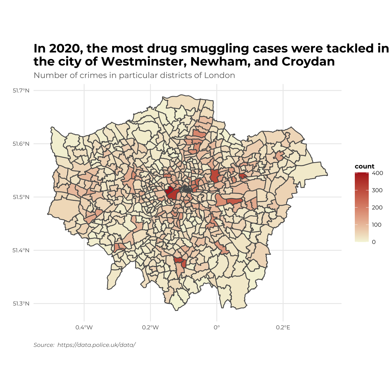 I will include the London district names on the map as well by adding a picture.
map_of_london_file <- image_read("http://ontheworldmap.com/uk/city/london/map-of-london.jpg") #loading an image
image_ggplot(map_of_london_file )+
theme( plot.title = element_text(color = "black",size=15,face="bold",vjust=270, family= "Montserrat"))+
ggtitle("Map of London for comparison")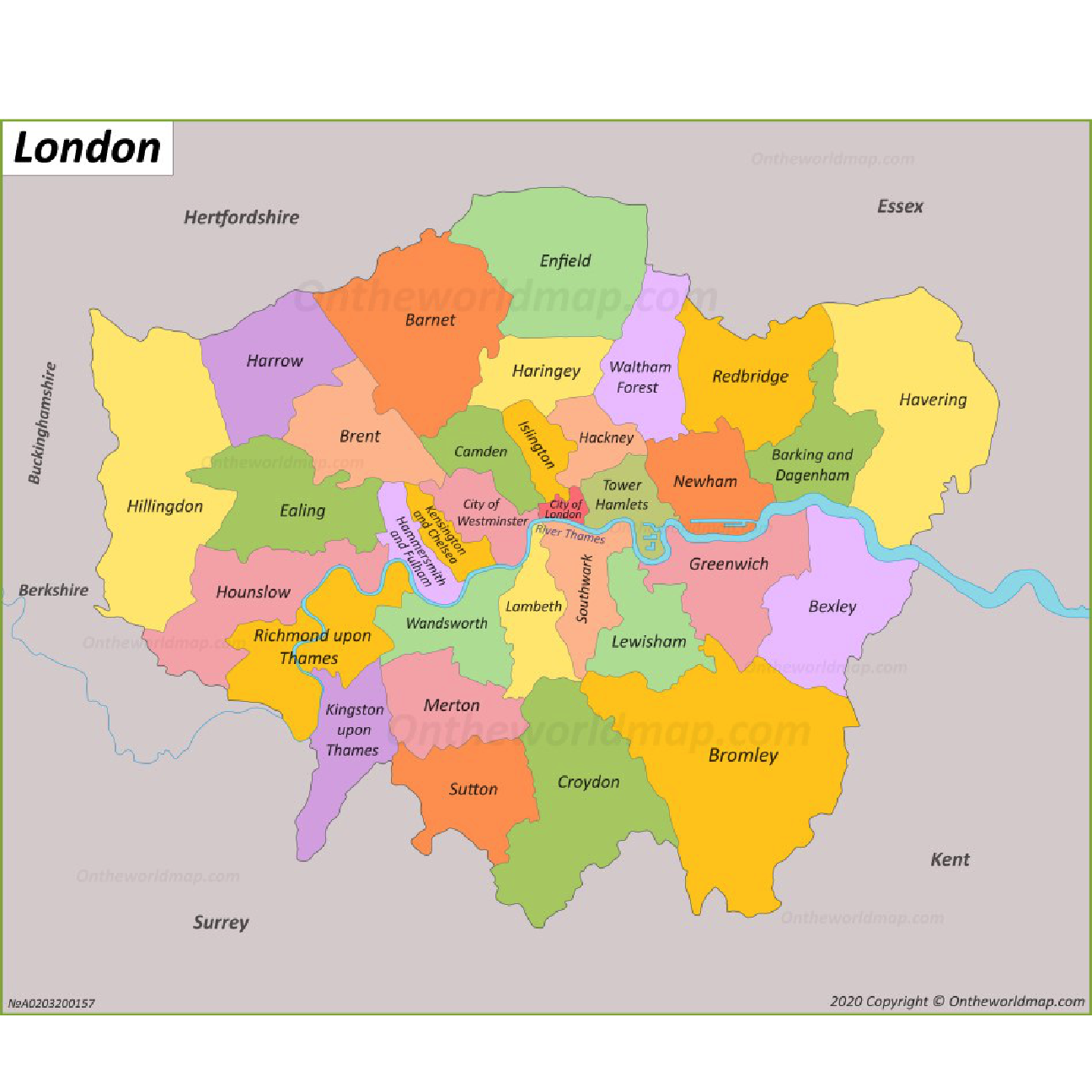
3rd Graph - Density plots
library(showtext)
font_add_google("Montserrat", "Montserrat") #downloading fonts from Google
showtext_auto()
my_colours3 <- c("tomato","greenyellow","cornflowerblue")
my_colours4 <- c("gray70", "firebrick2")
stop_search_offence_3<- stop_search_offence_sf %>%
filter(year!=2017) %>%
group_by(month_name,object_of_search) %>%
mutate(count= n()) %>%
mutate(
was_may = ifelse(month_name == "May", TRUE, FALSE))
ggplot(data =stop_search_offence_3 , aes(x= count, fill = object_of_search, colour=was_may, y=month_name))+
geom_density_ridges(alpha = 4/8)+
facet_grid(year~.)+
theme_minimal()+
theme( strip.text= element_text(family="Montserrat", face = "plain"),
plot.title = element_text(color = "black",size=10,face="bold", family= "Montserrat"),
plot.subtitle = element_text(color = "grey40", face="plain",size= 9.5,family= "Montserrat"),
plot.caption = element_text(color = "grey40", face="italic",size= 7,family= "Montserrat",hjust=0),
axis.text.y = element_text(size = 6, family="Montserrat", face = "plain"),
axis.text.x = element_text(size = 6, family="Montserrat", face = "plain"),
legend.text=element_text(family="Montserrat", size=5.5),
legend.title=element_text(family="Montserrat", size=6, face="bold"))+
labs(title = "In May in each year the number of crimes was the highest \n especially in crimes connected to controlled drugs issues ", subtitle= "Denisty plots oh cases by month & object of search particular years", x="", y="", fill = "Object of search", colour = "Was it May?",caption="Source: https://data.police.uk/data/")+
scale_fill_manual(values = my_colours3)+
scale_colour_manual(values = my_colours4)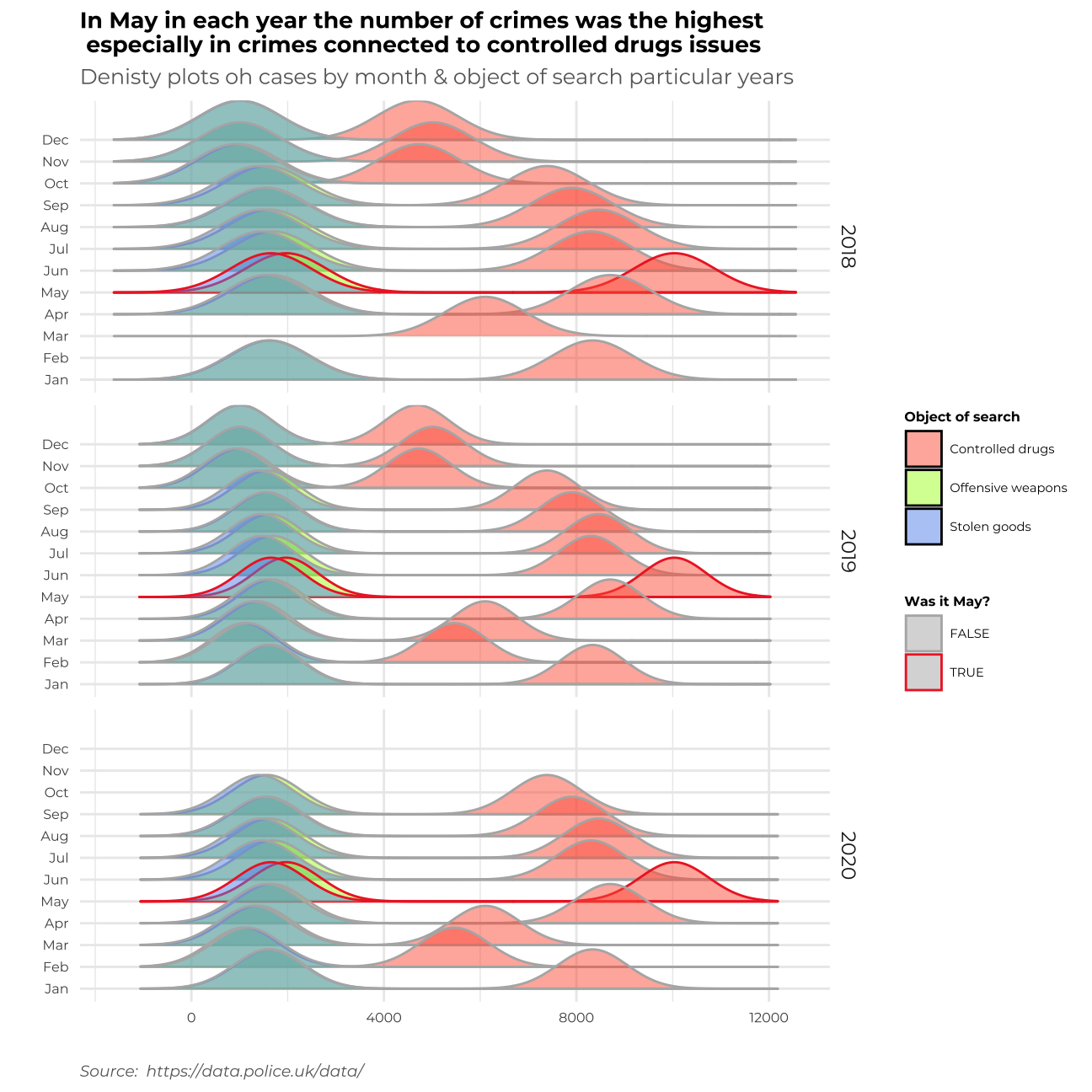
Summary
Let me write a short memo on my work and describe the story behind each graph.
In the first data visualization I tried to find the most frequent object of search – which is the problem of smuggling drugs. The crime has been increasing throughout recent years not only overall but also in all ethnic groups and across both genders.
In the second graph, I focused on locating the areas of London wherein the year 2020 all the crime connected to drug smuggling was the biggest problem. It turns out that most cases happened in the City of Westminster, Newnham, and Croydon.
In the third graph, I found the time of the year, when all the crimes (especially “Controlled drugs” crimes) are most frequent. It turns out that throughout the time, the most popular season for the raise of cases in May.
In my work, I tried to implement all of the C.R.A.P. principles. I applied _Contrast_ through adjusting colours to the type of graph – using different colours for different categories or to highlight a particular event, using hue to show the frequency of crimes in a particular location. _Repetition_ – where needed the colours to stay consistent and repetitive for the most important messages on the graph to stand out. _Alignment_ – I tried to allocate the information on my graphs clearly and transparently, so the visualization is easily understandable for the reader. _Proximity_ – I tried to make the graphs in such a form that the similar clusters of cases are allocated similarly.
I also tried to implement all of Alberto Cairo’s five qualities of great visualisaiton.
1. First of all, my graphs are truthful, not confusing, when it comes to colours as they tend to be the same throughout the whole file. I tried to use appropriate types of graphs to address different problems.
2. Second of all, my grpahs are functional and does not contain unnecessary information that could confuse the reader.
3. Moreover, I tried to make my graphs beautiful to make them easier to read – I used pleasant colours, fonts, and themes.
4. What’s more, thanks to the insightful aspect of the graphs, we can discover new pieces of information on crimes in London & build our knowledge on the topic.
5. Finally, I tried to make the whole story enlightening and coherent so that the reader is interested in the data presented.
Thank you!
