Stop & Search Police Data Visualisation
The raw data on “Stop and Search” comes from the following webiste.
I will analyse the follwing data: Date Range: Sep 2020 Metropolitan Police Service Include stop and search data
Basing on the “Stop and Search” dataset, I will prepare 3 visualisations having in mind best visualisation practics.
Loading Data
df<- read.csv("~/Documents/LBS/Data_Visualisation/01/2020-09/2020-09-metropolitan-stop-and-search.csv",na.strings="") #loading the file

df<- df %>%
  clean_names() %>%
  dplyr::select(1:3,5:13)


df_clean<- df %>%  na.omit()

#describe(df_clean)


df_clean<- df_clean %>% mutate(gender=as.factor(gender), age_range= as.factor(age_range),  officer_defined_ethnicity = as.factor( officer_defined_ethnicity))

df_clean$officer_defined_ethnicity <- df_clean$officer_defined_ethnicity %>% factor(levels= c("White", "Black", "Asian", "Other"))
DF <- table(df_clean$officer_defined_ethnicity)
DF
##
## White Black Asian Other
## 6348 5331 2759 711glimpse(df)## Rows: 19,928
## Columns: 12
## $ type <chr> "Person and Vehicle search", "Person sea…
## $ date <chr> "2020-08-31T23:00:00+00:00", "2020-08-31…
## $ part_of_a_policing_operation <chr> "False", "False", "False", "False", "Fal…
## $ latitude <dbl> 51.6, 51.4, 51.5, NA, NA, NA, 51.5, 51.4…
## $ longitude <dbl> 0.2153, -0.2253, 0.0443, NA, NA, NA, -0.…
## $ gender <chr> "Female", "Male", "Male", "Male", "Male"…
## $ age_range <chr> "18-24", "18-24", "over 34", NA, "18-24"…
## $ self_defined_ethnicity <chr> "White - English/Welsh/Scottish/Northern…
## $ officer_defined_ethnicity <chr> "White", "White", "White", "Black", "Bla…
## $ legislation <chr> "Misuse of Drugs Act 1971 (section 23)",…
## $ object_of_search <chr> "Controlled drugs", "Evidence of offence…
## $ outcome <chr> "A no further action disposal", "A no fu…First Graph
library(showtext)
font_add_google("Montserrat", "Montserrat") #downloading fonts from Google
showtext_auto()


df_race<- df_clean %>%  #only two genders
  filter(gender!="Other")
df_race<- df_race %>%
  group_by(officer_defined_ethnicity) %>%
  summarise(count = n())
df_race<- df_race %>%
  mutate(percent_race=count/sum(count))


my_colours <- c("grey70", "tomato")
df1<- df_race %>%
mutate(
    was_white = ifelse(officer_defined_ethnicity == "White", TRUE, FALSE))


ggplot(df1, aes(x=officer_defined_ethnicity, y=percent_race, fill=was_white)) +
    geom_bar(stat="identity", alpha=0.7)+
theme_classic() +
  theme(panel.grid.major.y = element_line(color = "gray60", size = 0.1),
        panel.background = element_rect(fill = "white", colour = "white"),
        axis.line = element_line(size = 1, colour = "grey80"),
        axis.ticks = element_line(size = 3,colour = "grey80"),
        axis.ticks.length = unit(.20, "cm"),
        plot.title = element_text(color = "tomato",size=15,face="bold", family= "Montserrat"),
        plot.subtitle = element_text(color = "tomato", face="plain", ,size= 10,family= "Montserrat"),
        plot.caption = element_text(color = "grey40", face="italic", ,size= 7,family= "Montserrat",hjust=0),
        axis.title.y = element_text(size = 8, angle = 90, family="Montserrat", face = "bold"),
        axis.text.y=element_text(family="Montserrat", size=7),
        axis.title.x = element_text(size = 8, family="Montserrat", face = "bold"),
        axis.text.x=element_text(family="Montserrat", size=7),
        legend.text=element_text(family="Montserrat", size=7),
        legend.title=element_text(family="Montserrat", size=8, face="bold"),
        legend.position = "none")+
    labs(title = " White people accounted to 41.9% of all the cases", subtitle= "Proportion of Stop & Searches by Ethnicity ", x="Officer defined ethnicity", y=" Percent", caption="Source:  https://data.police.uk/data/") +
  scale_y_continuous(labels = scales::percent)+
  scale_fill_manual(values = my_colours)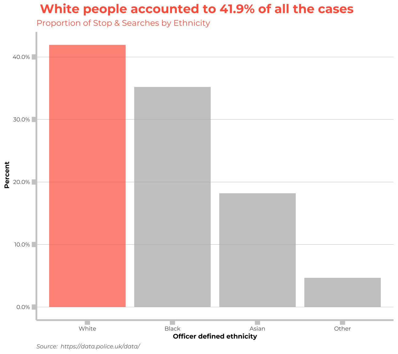
Second Graph
df_gender <-df_clean %>%
  filter(gender!="Other") %>%
  group_by(outcome,gender) %>%
  summarise(count=n(),
            total_percent = ( count/15149)) %>%
mutate(result = case_when(
    outcome %in% c("A no further action disposal") ~ "No futher action",
    outcome %in% c("Arrest") ~ "Arrest",
    outcome %in% c("Caution (simple or conditional)") ~ "Caution",
    outcome %in% c("Community resolution") ~ "Community",
    outcome %in% c("Penalty Notice for Disorder") ~ "Penalty",
    TRUE ~ "Summons"
    ),
    was_female= ifelse(gender== "Female", TRUE, FALSE),
    percent_female=(count/sum(count)))

df_gender<- df_gender %>%
mutate(percent_female= ifelse(gender== "Female",percent_female,NA))


ggplot(df_gender, aes(x=total_percent, y=reorder(result,total_percent), fill=was_female)) +
    geom_bar(stat="identity", alpha=0.7)+
theme_classic() +
  theme(panel.grid.major.y = element_line(color = "gray60", size = 0.1),
        panel.background = element_rect(fill = "white", colour = "white"),
        axis.line = element_line(size = 1, colour = "grey80"),
        axis.ticks = element_line(size = 3,colour = "grey80"),
        axis.ticks.length = unit(.20, "cm"),
        plot.title = element_text(color = "tomato",size=9.5,face="bold", family= "Montserrat"),
        plot.subtitle = element_text(color = "tomato", face="plain", ,size= 9,family= "Montserrat"),
        plot.caption = element_text(color = "grey40", face="italic", ,size= 7,family= "Montserrat",hjust=0),
        axis.title.y = element_text(size = 7, angle = 90, family="Montserrat", face = "bold"),
        axis.text.y=element_text(family="Montserrat", size=7),
        axis.title.x = element_text(size = 7, family="Montserrat", face = "bold"),
        axis.text.x=element_text(family="Montserrat", size=7),
        legend.text=element_text(family="Montserrat", size=7),
        legend.title=element_text(family="Montserrat", size=8, face="bold"))+
    labs(title = "Women comprised the biggest percentage in S&S actions resulting with\n Community resolution", subtitle= " Proportion of Stop & Searches by Gender and Result", x="Percent", y="Result",fill= "Gender",caption="Source:  https://data.police.uk/data/") +
  scale_x_continuous(labels = scales::percent)+
  scale_fill_manual(values = my_colours, labels = c( "Male", "Female")) +
  geom_text(
    aes(label = round(percent_female,3)*100, x = round(percent_female,3)/2),
    color = "tomato",
    size = 3,
hjust = 0.5) 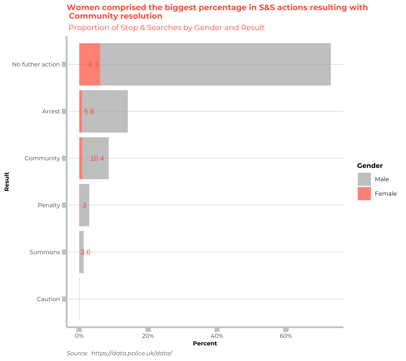
Third Graph
df3<- df_clean %>%
  group_by(age_range,gender,object_of_search) %>%
  summarise(count = n())

df3$age_range <- df3$age_range %>% factor(levels= c("under 10", "10-17", "18-24", "25-34", "over 34"))

df3<- df3 %>%
  filter(age_range!="under 10") %>%
  mutate(percent_race=count/sum(count))
df3<- df3 %>%
 mutate(percentageoftotal = (count/15144),
object_of_search=as.factor(object_of_search)) %>%
  mutate(object = case_when(
    object_of_search %in% c("Anything to threaten or harm anyone","Firearms","Offensive weapons") ~ "Objects to threaten or harm",
    object_of_search %in% c("Articles for use in criminal damage") ~ "Objects for use in criminal damage",
    object_of_search %in% c("Controlled drugs") ~ "Controlled drugs",
    object_of_search %in% c("Evidence of offences under the Act") ~ "Evidence of offences under the Act",
    object_of_search %in% c("Stolen goods") ~ "Stolen goods",
    object_of_search %in% c("Fireworks") ~ "Fireworks",
    TRUE ~ "Not Stated"
  ))


colours_age <- c("#D3C54D","#B4D63E","#54B4BD","#1D445F", "#14848F","#FDAF49", "#C17716", "#F58723")

ggplot(df3, aes(x=age_range,
                       y = percentageoftotal,
                                  fill = object_of_search)) +
  geom_bar(stat = "identity", width=0.7, position="stack") + theme_classic() +
  theme(panel.grid.major.y = element_line(color = "gray60", size = 0.1),
        panel.background = element_rect(fill = "white", colour = "white"),
        axis.line = element_line(size = 1, colour = "grey80"),
        axis.ticks = element_line(size = 3,colour = "grey80"),
        axis.ticks.length = unit(.20, "cm"),
        plot.title = element_text(color = "grey20",size=9.5,face="bold", family= "Montserrat"),
        plot.subtitle = element_text(color = "grey20", face="plain", ,size= 9,family= "Montserrat"),
        plot.caption = element_text(color = "grey40", face="italic", ,size= 7,family= "Montserrat",hjust=0),
        axis.title.y = element_text(size = 8, angle = 90, family="Montserrat", face = "bold"),
        axis.text.y=element_text(family="Montserrat", size=7),
        axis.title.x = element_text(size = 8, family="Montserrat", face = "bold"),
        axis.text.x=element_text(family="Montserrat", size=7),
        legend.text=element_text(family="Montserrat", size=5.5),
        legend.title=element_text(family="Montserrat", size=6, face="bold"))+
    labs(title = "Across all the age groups, controlled drugs was the main reason of search", subtitle= "Proportion of Stop & Searches by age and object of search", x="Officer defined ethnicity", y="Percent",fill= "Object of search",caption="Source:  https://data.police.uk/data/") +
  scale_y_continuous(labels = scales::percent)+
  scale_fill_manual(values= colours_age)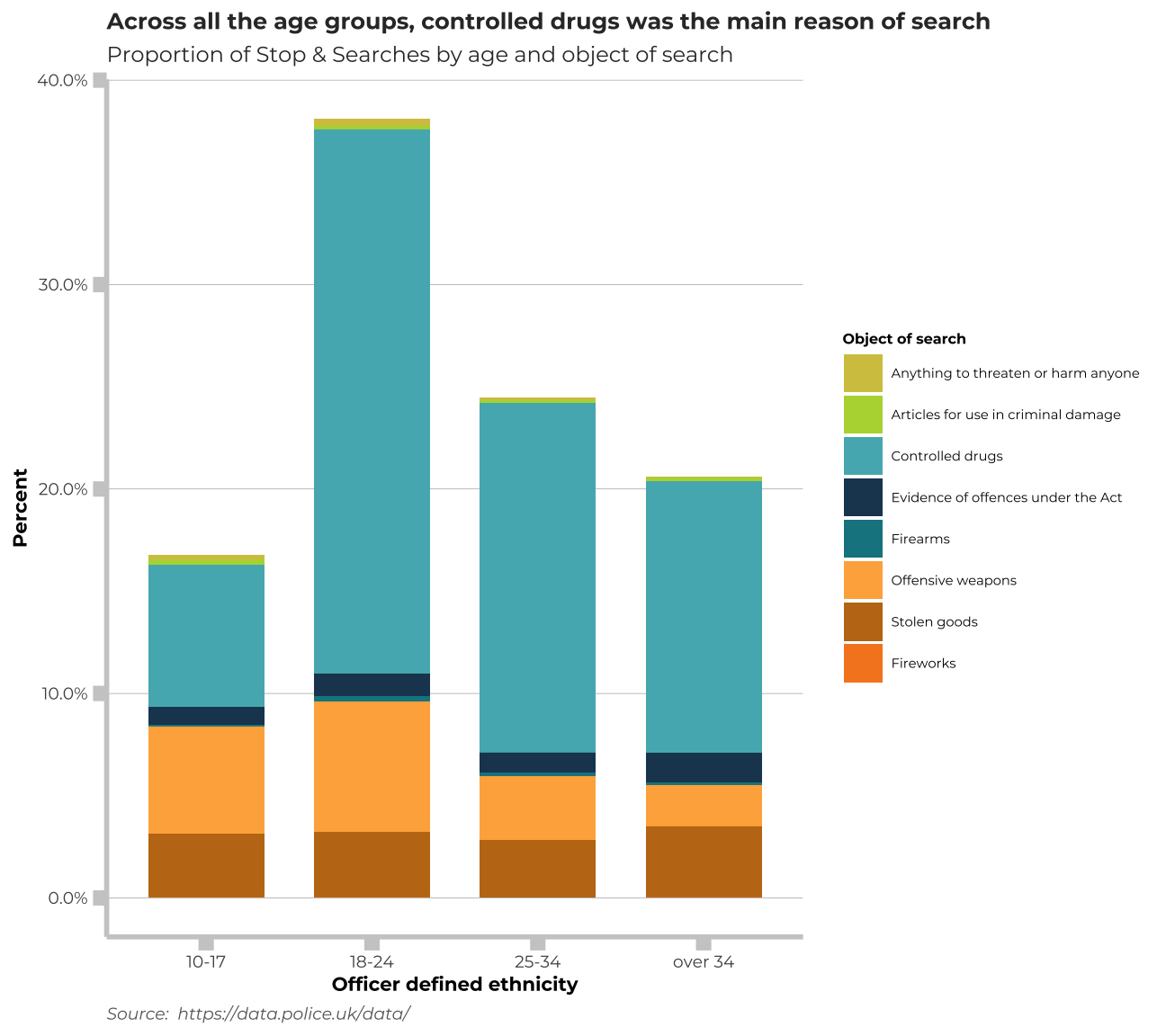
Thank you!
