Clustering BBC iPlayer users using K means, PAM and H-Clustering methods
Introduction and BBC iPlayer streaming data
The BBC is one of the oldest broadcasting organisations of the world. As a public service, its aim is to inform, educate, and entertain the UK population. Due to this broad mission, its key performance measures are not associated with financial profit but instead with how well it manages to engage the wider public with its program offering. To achieve its mission, it is particularly important to know which customer segments are interested in what content and how this drives their engagement with the BBC (often measured by how happy they are to pay for the TV licensing fees).
Traditionally, the BBC reached its audience through terrestrial broadcasting, first analogue and then digital, which made it difficult to monitor public engagement. This had to been done retrospectively by monitoring a relatively small sample of representative consumers who consented to having their TV-watching habits observed and recorded. More recently, the BBC launched a digital TV streaming service, the BBC iPlayer, which allows streaming BBC content on demand. Besides being a more convenient way to deliver content to the public, the streaming service allows the BBC to get a more detailed perspective of public engagement. In time, this should allow the BBC to better predict how different customer segments react to the programs it offers and become more effective in informing, educating, and entertaining them.
The goal of this project is to use data mining techniques to gain a data-based view of BBC’s iPlayer customers and the content it provides.
In the first step I will process the raw data for analysis. I need to clean and enrich the data.
I have an engagement based data and in the second step I will convert this to a user based data. Also I will engineer new features.
In the third step I will create meaningful customer segments for the users of the BBC iPlayer. In this step I will use K-Means, K-Medoid and H-Clustering methods to determine meaningful clusters for iPlayer viewers.
The original data file contains information extracted from the BBC iPlayer database. The dataset was created by choosing approximately 10000 random viewers who watched something on iPlayer in January and then recording their viewing behaviour until the end of April. This means that customers who did not watch in January will not be in the dataset. Every row represents a viewing event. Given the way the data was created, during January the data is representative of what is watched on the iPlayer. After January the data is no longer representative as it is no longer a random sample of the people watching iPlayer content.
Cleaned Data
The data is already processed and cleaned.
In this step I will first generate a user-based database which I will use to train clustering algorithms to identify meaningful clusters in the data.
Let’s load the cleaned data and investigate what’s in the data.
cleaned_BBC_Data <- read_csv("~/Documents/LBS/Data Science/Session 07/WORKSHOP materials/Results_Step1.csv",col_names=TRUE)
library(dplyr)
glimpse(cleaned_BBC_Data)
## Rows: 313,256
## Columns: 17
## $ user_id <chr> "cd2006", "cd2006", "cd2006", "cd2006", "cd…
## $ program_id <chr> "b8fbf2", "e2f113", "0e0916", "ca03b9", "cf…
## $ series_id <chr> "e0480e", "933a1b", "b68e79", "5d0813", "eb…
## $ genre <chr> "Comedy", "Factual", "Entertainment", "Spor…
## $ start_date_time <dttm> 2017-01-19 22:17:04, 2017-02-14 19:12:36, …
## $ streaming_id <chr> "1484864257965_1", "1487099603980_1", "1484…
## $ prog_duration_min <dbl> 1.85, 0.50, 1.37, 1.62, 8.50, 17.38, 0.50, …
## $ time_viewed_min <dbl> 1.850, 0.499, 1.367, 1.617, 5.762, 0.501, 0…
## $ duration_more_30s <dbl> 1, 1, 1, 1, 1, 1, 1, 1, 1, 1, 1, 1, 1, 1, 1…
## $ time_viewed_more_5s <dbl> 1, 1, 1, 1, 1, 1, 1, 1, 1, 1, 1, 1, 1, 1, 1…
## $ percentage_program_viewed <dbl> 1.00000, 0.99817, 1.00000, 1.00000, 0.67784…
## $ watched_more_60_percent <dbl> 1, 1, 1, 1, 1, 0, 0, 1, 1, 0, 0, 1, 1, 0, 0…
## $ month <dbl> 1, 2, 1, 2, 3, 2, 4, 3, 4, 3, 3, 4, 3, 3, 2…
## $ day <dbl> 5, 3, 4, 1, 1, 3, 1, 6, 7, 7, 1, 5, 7, 3, 2…
## $ hour <dbl> 22, 19, 21, 14, 20, 19, 20, 21, 21, 20, 18,…
## $ weekend <chr> "weekday", "weekday", "weekday", "weekend",…
## $ time_of_day <chr> "Evening", "Evening", "Evening", "Day", "Ev…The column descriptions are as follows.
user_id – a unique identifier for the viewer
program_id and series_id – these identify the program and the series that the program belongs to
genre – the programme’s genre (e.g., drama, factual, news, sport, comedy, etc)
start_date_time – the streaming start date/time of the event
Streaming id – a unique identifier per streaming event
prog_duration_min – the program duration in minutes
time_viewed_min – how long the customer watched the program in minutes
duration_more_30s - equals 1 if the program duration is more than 30 seconds, equals 0 otherwise
time_viewed_more_5s - equals 1 if time_viewed is more than 5 seconds, equals 0 otherwise
percentage_program_viewed – percantage of the program viewed
watched_more_60_percent – equals 1 if more than 60% of the program is watched, equals 0 otherwise
month, day, hour, weekend – timing of the viewing
time_of_day – equals “Night” if the viewing occurs between 22 and 6am, “Day” if it occurs between 6AM and 14, “Afternoon” if the it occurs between 14 and 17, “Evening” otherwise
Before I proceed let’s consider the usage in January only.
cleaned_BBC_Data<-filter(cleaned_BBC_Data,month==1)User based data
I will try to create meaningful customer segments that describe users of the BBC iPlayer service. First I need to change the data to user based and generate a summary of their usage.
Data format
The data is presented in an event-based format (every row captures a viewing event). However I need to detect the differences between the general watching habits of users.
As my focal interest is the customer and not the event, given that I want to detect the differences between viewing habits of users, it needs to be converted into a customer-based dataset.
Feature Engineering
In this step, I will generate the following variables for each user.
- Total number of shows watched and ii. Total time spent watching shows on iPlayer by each user in the data
userData<-cleaned_BBC_Data %>% group_by(user_id) %>% summarise(noShows=n(), total_Time=sum(time_viewed_min)) - Proportion of shows watched during the weekend for each user.
#Let's find the number of shows on weekend and weekdays
userData2<-cleaned_BBC_Data %>% group_by(user_id,weekend) %>% summarise(noShows=n())

#Let's find percentage in weekend and weekday
userData3 = userData2%>% group_by(user_id) %>% mutate(weight_pct = noShows / sum(noShows))

#Let's create a data frame with each user in a row.
userData3<-select (userData3,-noShows)
userData3<-userData3%>% spread(weekend,weight_pct,fill=0) %>%as.data.frame()
#Let's merge the final result with the data frame from the previous step.
userdatall<-left_join(userData,userData3,by="user_id")- Proportion of shows watched during different times of day for each user.
#Code in this block follows the same steps above.
userData2<-cleaned_BBC_Data %>% group_by(user_id,time_of_day) %>% summarise(noShows=n()) %>% mutate(weight_pct = noShows / sum(noShows))

userData4<-select (userData2,-c(noShows))
userData4<-spread(userData4,time_of_day,weight_pct,fill=0)

userdatall<-left_join(userdatall,userData4,by="user_id")
I will find the proportion of shows watched in each genre by each user.
userData5<- cleaned_BBC_Data %>% group_by(user_id, genre) %>% summarise(noShows=n())%>% mutate(prop_genre = noShows / sum(noShows)) %>% select(prop_genre, user_id,genre)
#results to the data frame userdatall
userData7<-spread(userData5,genre,prop_genre,fill=0)


userdatall<-left_join(userdatall,userData7,by="user_id")
I will further include the average proportion of programmes watched (in minutes) per user. This is important as engagement cannot just be evaluated based on whether a customer clicked on a programme (recorded as a stream) or not; we must consider the duration that the customer was watching different content. If I simply calculated the average time viewed the result would be biased by the many views that were 1 minute or even less. Therefore I calculate it as this proportion.
userData6 <- cleaned_BBC_Data %>% group_by(user_id) %>% summarise(avg_prop_view=sum(time_viewed_min)/sum(prog_duration_min))
#results to the data frame userdatall
userdatall<-left_join(userdatall,userData6,by="user_id")

#glimpse(userdatall)
Visualising user-based data
Next I will visualise the information captured in the user based data.
I will start with the correlations.
library("GGally")
userdatall %>%
  select(-user_id) %>% #keep Y variable last
  ggcorr(method = c("pairwise", "pearson"), layout.exp = 3,label_round=2, label = TRUE,label_size = 2,hjust = 1)
The most correlated variables are noShows & total_time, and weekend & weekday which has a perfect negative correlation. We know that usually highly correlated variables such as these ones should be deleted due to the risk of collinearity, however as an implication there may be a lack of information (e.g. deleting day and keeping the rest of the 3 values for time of day).
The PCA we will perform later on will also tackle this issue.
I will investigate the distribution of noShows and total_Time using box-whisker plots and histograms.
ggplot(userdatall, aes(y=noShows)) +geom_boxplot()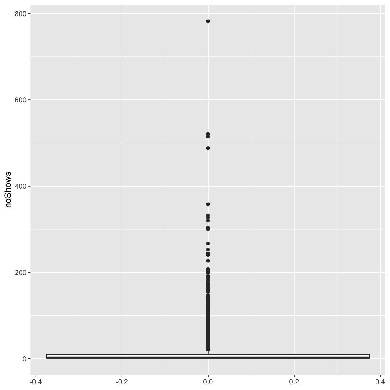
ggplot(userdatall, aes(y=total_Time)) +geom_boxplot()#+scale_y_log10()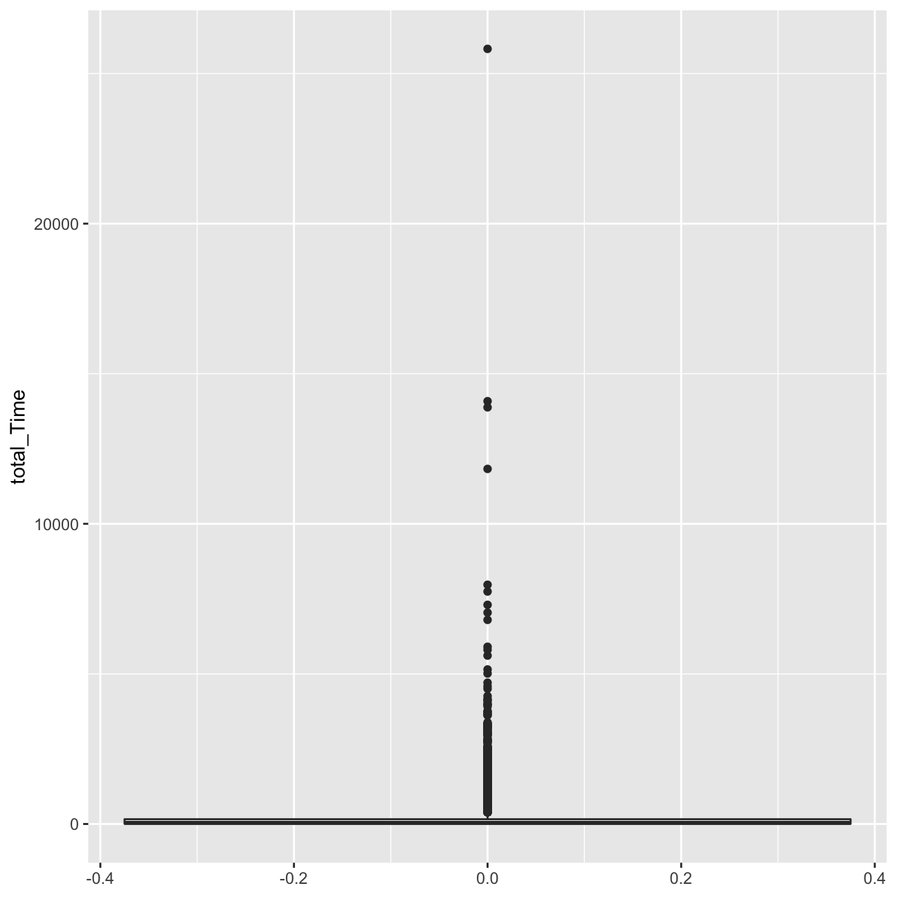
ggplot(userdatall, aes( x=noShows)) +
geom_histogram(binwidth = 5)+xlim(0,200) 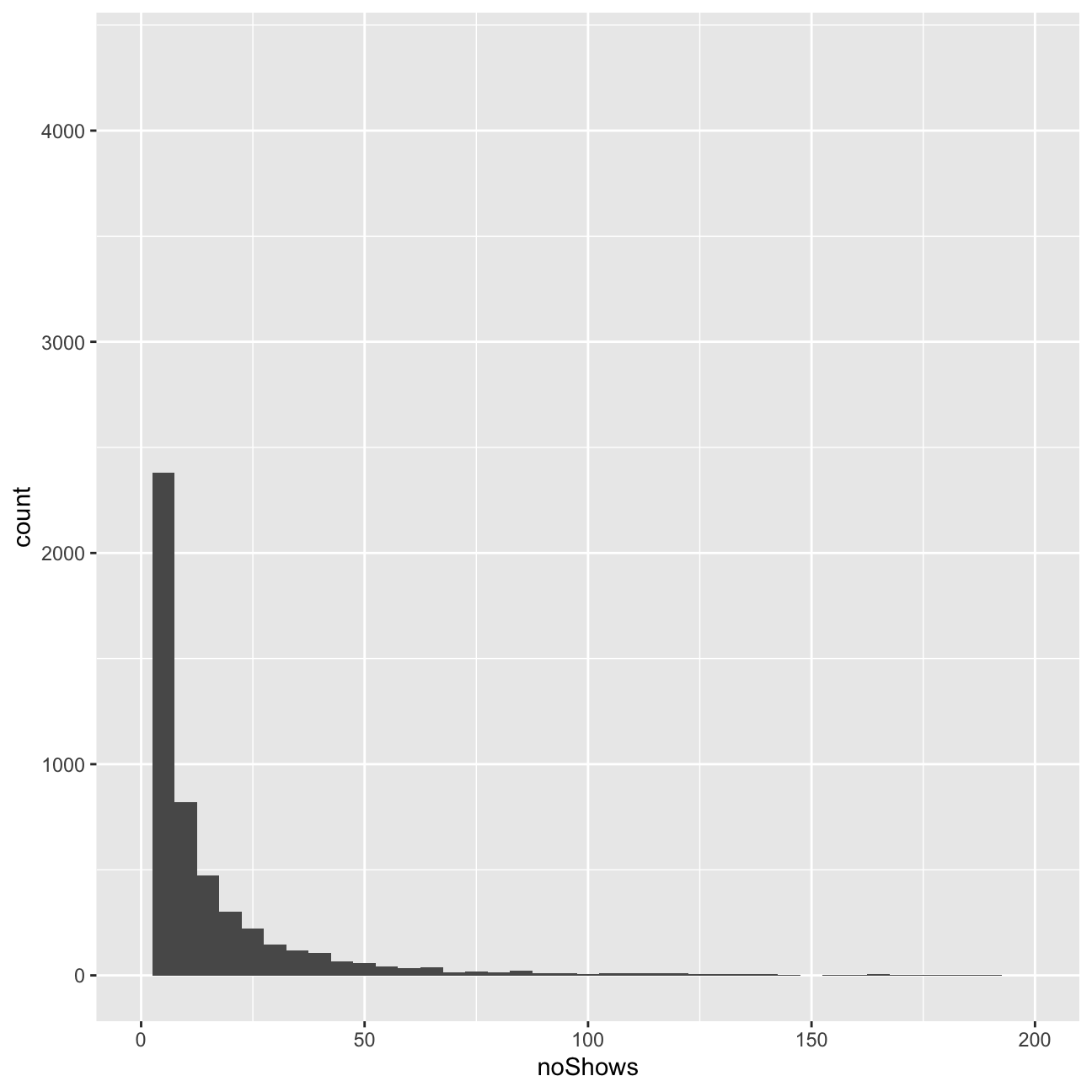
ggplot(userdatall, aes( x=total_Time)) +geom_histogram(binwidth = 2.5)+xlim(0,180)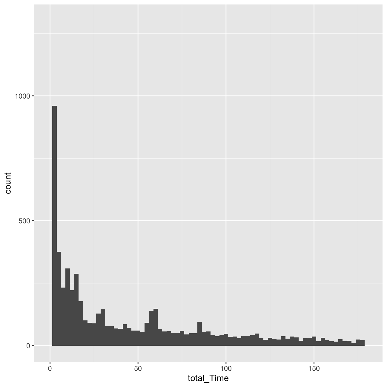 We can observe a number of outliers in the number of shows watched and the total time variable.
Regarding the histograms, we can observe that they are heavily right-skewed. The vast majority of users watches less than 10 minutes in terms of total time, and 10 or less shows. Due to this heavy skew in the data, I should be indeed worried about it.
We can observe a number of outliers in the number of shows watched and the total time variable.
Regarding the histograms, we can observe that they are heavily right-skewed. The vast majority of users watches less than 10 minutes in terms of total time, and 10 or less shows. Due to this heavy skew in the data, I should be indeed worried about it.
Delete infrequent users
I will delete now the records for users whose total view time is less than 5 minutes and who views 5 or fewer programs. These users are not very likely to be informative for clustering purposes. Or I can view these users as a ``low-engagement’’ cluster.
userdata_red<-userdatall%>%filter(total_Time>=5)%>%filter(noShows>=5)

ggplot(userdata_red, aes(x=total_Time)) +geom_histogram(binwidth=25)+labs(x="Total Time Watched (mins)", y= "Count")+ xlim(0,3000)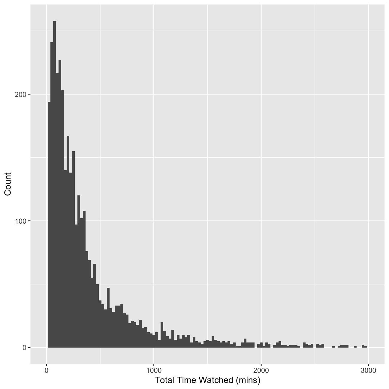
glimpse(userdata_red)## Rows: 3,625
## Columns: 22
## $ user_id <chr> "002b2e", "0059d9", "00aad3", "00c6e6", "00caa7", "00e3…
## $ noShows <int> 31, 20, 8, 16, 16, 5, 6, 7, 5, 7, 36, 5, 8, 5, 11, 6, 8…
## $ total_Time <dbl> 534.36, 446.05, 38.00, 148.46, 167.24, 44.82, 44.78, 12…
## $ weekday <dbl> 0.871, 0.750, 1.000, 0.812, 0.250, 1.000, 0.833, 0.714,…
## $ weekend <dbl> 0.1290, 0.2500, 0.0000, 0.1875, 0.7500, 0.0000, 0.1667,…
## $ Afternoon <dbl> 0.0000, 0.1500, 0.0000, 0.0000, 0.3750, 0.0000, 0.5000,…
## $ Day <dbl> 0.0968, 0.4500, 0.0000, 0.0000, 0.1250, 0.0000, 0.5000,…
## $ Evening <dbl> 0.806, 0.400, 0.750, 1.000, 0.500, 0.200, 0.000, 0.429,…
## $ Night <dbl> 0.0968, 0.0000, 0.2500, 0.0000, 0.0000, 0.8000, 0.0000,…
## $ Children <dbl> 0.000, 0.000, 0.000, 0.000, 0.000, 0.000, 0.000, 0.000,…
## $ Comedy <dbl> 0.0645, 0.0000, 0.2500, 0.0000, 0.0000, 0.0000, 0.3333,…
## $ Drama <dbl> 0.3226, 0.0000, 0.0000, 0.0625, 0.8125, 0.0000, 0.6667,…
## $ Entertainment <dbl> 0.0645, 0.1000, 0.0000, 0.3750, 0.0000, 0.0000, 0.0000,…
## $ Factual <dbl> 0.4194, 0.3000, 0.2500, 0.5000, 0.1875, 1.0000, 0.0000,…
## $ Learning <dbl> 0.0000, 0.0000, 0.0000, 0.0000, 0.0000, 0.0000, 0.0000,…
## $ Music <dbl> 0.0645, 0.0000, 0.0000, 0.0000, 0.0000, 0.0000, 0.0000,…
## $ News <dbl> 0.0323, 0.5000, 0.3750, 0.0000, 0.0000, 0.0000, 0.0000,…
## $ NoGenre <dbl> 0.0, 0.0, 0.0, 0.0, 0.0, 0.0, 0.0, 0.0, 0.0, 0.0, 0.0, …
## $ RelEthics <dbl> 0.0000, 0.0000, 0.0000, 0.0625, 0.0000, 0.0000, 0.0000,…
## $ Sport <dbl> 0.0323, 0.0500, 0.1250, 0.0000, 0.0000, 0.0000, 0.0000,…
## $ Weather <dbl> 0.0000, 0.0500, 0.0000, 0.0000, 0.0000, 0.0000, 0.0000,…
## $ avg_prop_view <dbl> 0.2937, 0.3098, 0.0884, 0.2028, 0.1616, 0.3143, 0.1483,…Clustering with K-Means
Now I am ready to find clusters in the BBC iPlayer viewers. I will start with the K-Means algorithm.
Training a K-Means Model
I will first train a K-Means model. I will start with 2 clusters. I need to make sure to de-select user_id variable and scale the data. I will use 50 random starts.
k=2

#Create new columns of prop_genres
userdatall %>%
  select(-user_id) %>% #keep Y variable last
  ggcorr(method = c("pairwise", "pearson"), layout.exp = 3,label_round=2, label = TRUE,label_size = 2,hjust = 1)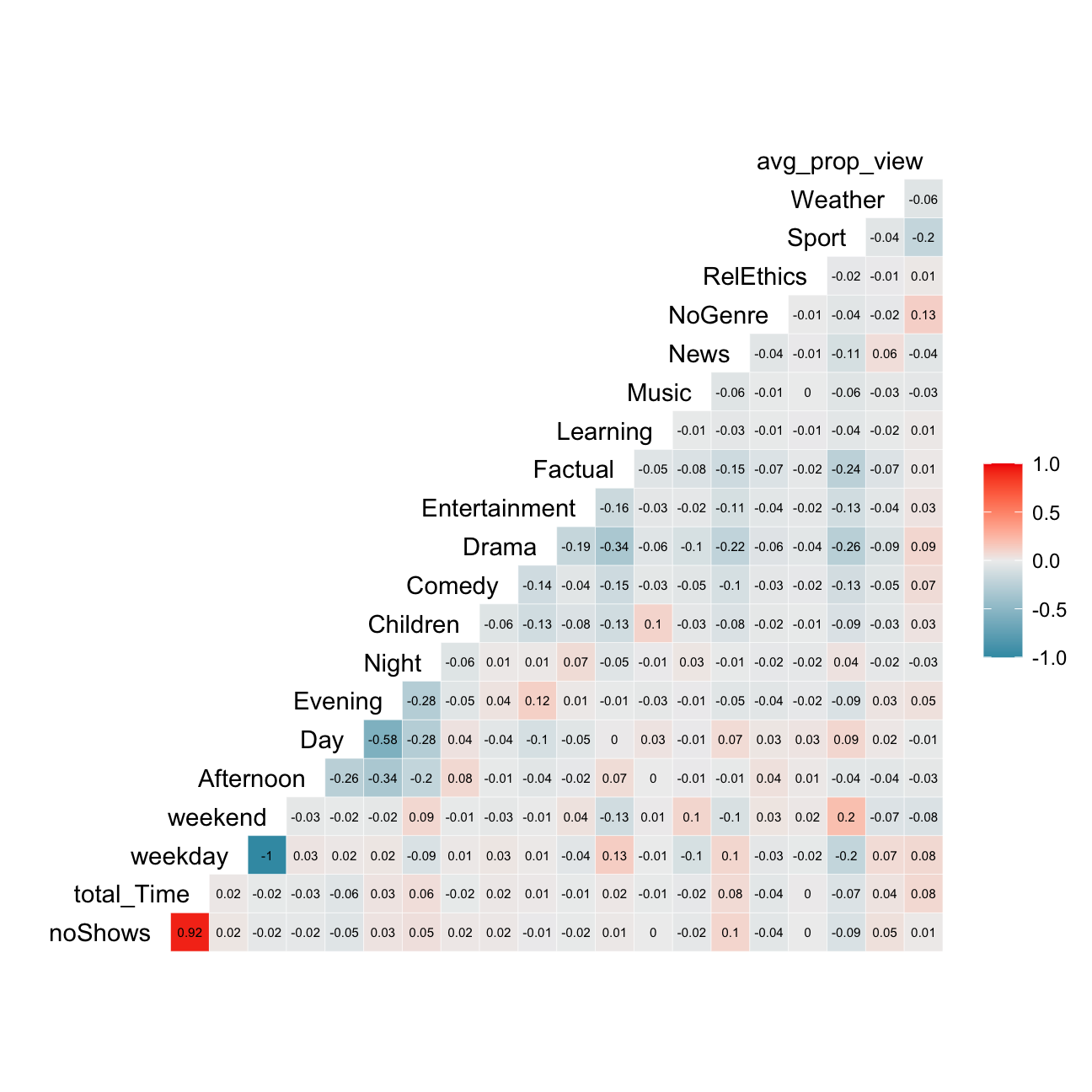
# Get rid of variables that is not needed. Do not include no shows as well because it is highly correlated with total time
userdata_red_select<-userdata_red %>%
  select(-c(user_id, noShows, weekday))

#log transform total time to reduce the impact of outliers
userdata_red_select<-userdata_red_select %>%
  mutate(total_Time = log(total_Time))

#scale the data
userdata_red_select<-data.frame(scale(userdata_red_select))

#train kmeans clustering
model_kmeans_2clusters<-eclust(userdata_red_select, "kmeans", k = 2,nstart = 50, graph = FALSE)
summary(model_kmeans_2clusters)
## Length Class Mode
## cluster 3625 -none- numeric
## centers 38 -none- numeric
## totss 1 -none- numeric
## withinss 2 -none- numeric
## tot.withinss 1 -none- numeric
## betweenss 1 -none- numeric
## size 2 -none- numeric
## iter 1 -none- numeric
## ifault 1 -none- numeric
## silinfo 3 -none- list
## nbclust 1 -none- numeric
## data 19 data.frame listmodel_kmeans_2clusters<-eclust(userdata_red_select, "kmeans", k = 2,nstart = 70, graph = FALSE)
summary(model_kmeans_2clusters)## Length Class Mode
## cluster 3625 -none- numeric
## centers 38 -none- numeric
## totss 1 -none- numeric
## withinss 2 -none- numeric
## tot.withinss 1 -none- numeric
## betweenss 1 -none- numeric
## size 2 -none- numeric
## iter 1 -none- numeric
## ifault 1 -none- numeric
## silinfo 3 -none- list
## nbclust 1 -none- numeric
## data 19 data.frame list#add clusters to the data frame
model_kmeans_2clusters_size<-data.frame(cluster=as.factor(c(1:2)),model_kmeans_2clusters$center, model_kmeans_2clusters$size)
model_kmeans_2clusters_size## cluster total_Time weekend Afternoon Day Evening Night Children Comedy
## 1 1 -0.384 -0.1007 0.566 0.927 -0.831 -0.424 0.396 -0.1947
## 2 2 0.192 0.0503 -0.282 -0.463 0.415 0.212 -0.198 0.0972
## Drama Entertainment Factual Learning Music News NoGenre RelEthics
## 1 -0.369 -0.0618 0.0751 0.218 0.0248 0.1949 0.0771 0.1134
## 2 0.184 0.0308 -0.0375 -0.109 -0.0124 -0.0973 -0.0385 -0.0566
## Sport Weather avg_prop_view model_kmeans_2clusters.size
## 1 0.0941 0.0278 -0.316 1207
## 2 -0.0470 -0.0139 0.158 2418The two resulting clusters have respective sizes of 1207 and 2418.
Visualizing the results
Cluster centers
In this step, I will plot the normalized cluster centers and describe the clusters that the algorithm suggests.
#First generate a new data frame with cluster centers and cluster numbers
model_kmeans_2clusters_center<-data.frame(cluster=as.factor(c(1:2)),model_kmeans_2clusters$centers)

#transpose this data frame
centers_of_cluster_trans<-model_kmeans_2clusters_center %>% gather(variable,value,-cluster,factor_key = TRUE)

#plot the centers
graph_2means<-ggplot(centers_of_cluster_trans, aes(x = variable, y = value))+  geom_line(aes(color =cluster,group = cluster), linetype = "dashed",size=1)+ geom_point(size=1,shape=4)+geom_hline(yintercept=0)+theme(text = element_text(size=10),
        axis.text.x = element_text(angle=45, hjust=1),)+ggtitle("Centers of clusters when k=2")

graph_2means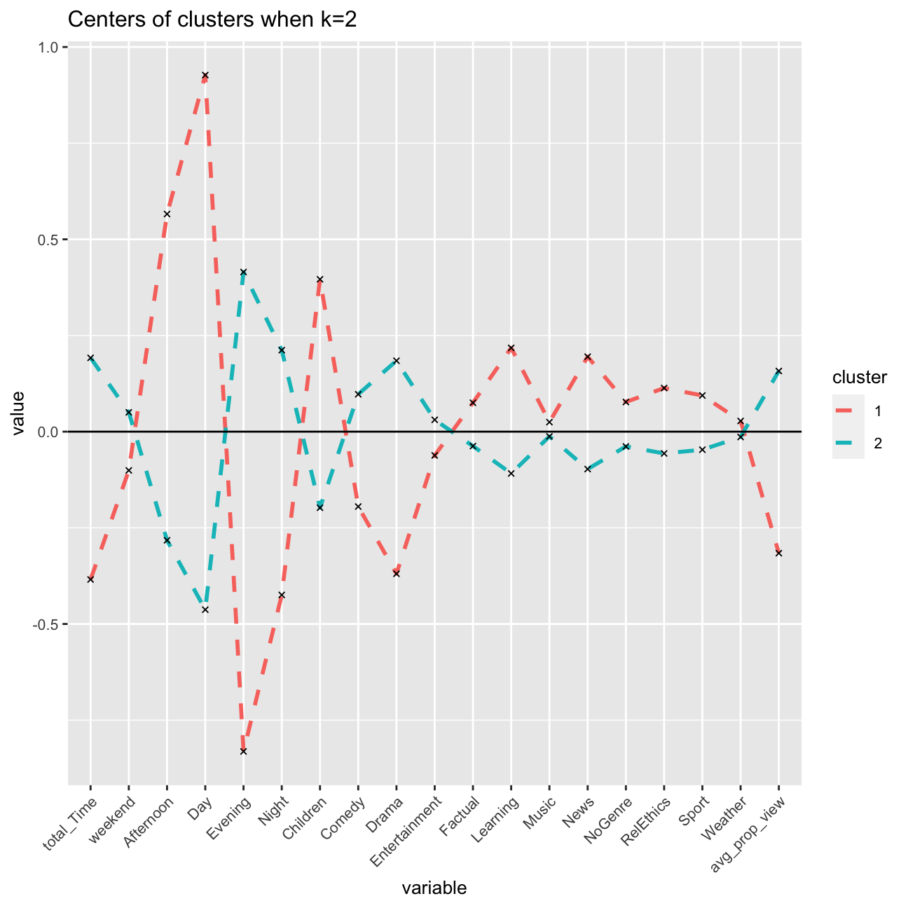
The two resulting clusters are quite different, and can be interpreted to be meaningful. Cluster 2 pinpoints to afternoon and day, children, and learning, which associates to children’s usage of BBC after school. These are young educational users.
Cluster 1 on the other hand pinpoints more towards users who watch in the evening, with another relative high point towards the genre of drama (and also comedy). These would be entertainment users, likely adults, that have longer working days and watch programmes after work in the evening.
Clusters vs variables
In this step, I will plot a scatter plot for the viewers with respect to total_Time and weekend variables with color set to the cluster number of the user and describe my observations.
# add it to the original data frame
userDataclustered<-mutate(userdata_red_select, cluster = as.factor(model_kmeans_2clusters$cluster))

#total_Time and weekend
a<-ggplot(userDataclustered, aes(x = total_Time, y = weekend, color =  cluster)) +
  geom_jitter()+labs(color = "Cluster")+ggtitle("Comparing total_Time and weekend")
# Note that geom_jitter adds a small noise to each observation so that we can see overlapping points

#total_Time and Children
b<-ggplot(userDataclustered, aes(x = total_Time, y = Children, color = cluster)) +
  geom_jitter()+labs(color = "Cluster")+ggtitle("Comparing total_Time and Children")
#Children seems like a significant variable to differentiate the clusters.

#Let's arrange these visualizations so that they fit in the html file nicely
grid.arrange(a, b, nrow = 2)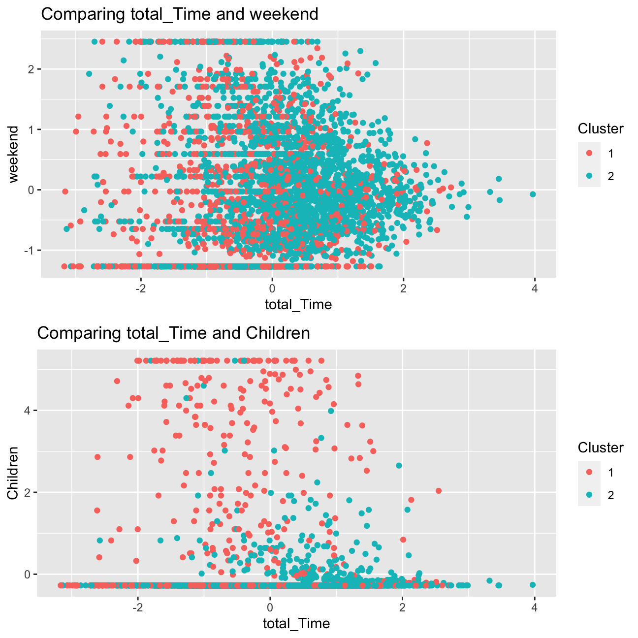
We can definitely observe a more clear distinction in the second scatter plot, between the variables children and total_Time for both clusters. This supports the observations I had above, the one of the clusters would be young educational users, and that this segment differs in terms of total_Time to users in cluster 2 is clearly shown.
I can see in the first scatter plot that there is a greater overlap in the points for both clusters. Despite the relatively equal spread showing that users in both clusters watch programmes on the weekend, the plot shows that users in cluster 2 (presumed entertainment users) spend more time on the weekend watching programmes.
Overall though, the variable children appears to have a prominent role in the determination of clusters of users.
Clusters vs PCA components
I will repeat the previous step and use the first two principle components using fviz_cluster function.
#Cluster plot when k=2

fviz_cluster(model_kmeans_2clusters, userDataclustered, palette = "Set2", alpha = 0.5, ggtheme = theme_minimal())+ ggtitle("Cluster plot with log when k=2")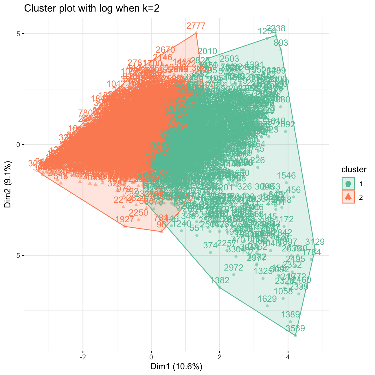
Clusters vs PCA components without log transform
As a “side exercise”, I will use K-means method again but this time I will not log transform total time and include no_shows as well. Then, I will compare my results to the case when I use log transformation. Then I will visualize the first two principle components using fviz_cluster function.
#select the data without log
userdata_red_select_nolog<-userdata_red %>%
  select(-c(user_id, weekday))

#scale the data
userdata_red_select_nolog<-data.frame(scale(userdata_red_select_nolog))

#train kmeans clustering
model_kmeans_2clusters_nolog<-eclust(userdata_red_select_nolog, "kmeans", k = 2,nstart = 50, graph = FALSE)
summary(model_kmeans_2clusters_nolog)
## Length Class Mode
## cluster 3625 -none- numeric
## centers 40 -none- numeric
## totss 1 -none- numeric
## withinss 2 -none- numeric
## tot.withinss 1 -none- numeric
## betweenss 1 -none- numeric
## size 2 -none- numeric
## iter 1 -none- numeric
## ifault 1 -none- numeric
## silinfo 3 -none- list
## nbclust 1 -none- numeric
## data 20 data.frame list#size of the cluster withoulog
model_kmeans_2clusters_nolog_size<-data.frame(cluster=as.factor(c(1:2)), model_kmeans_2clusters_nolog$center, model_kmeans_2clusters_nolog$size)
model_kmeans_2clusters_nolog_size## cluster noShows total_Time weekend Afternoon Day Evening Night Children
## 1 1 -0.1030 -0.1541 -0.0851 0.559 0.935 -0.822 -0.440 0.344
## 2 2 0.0553 0.0827 0.0456 -0.300 -0.502 0.441 0.236 -0.185
## Comedy Drama Entertainment Factual Learning Music News NoGenre
## 1 -0.189 -0.318 -0.067 0.0848 0.194 0.0189 0.1817 0.0395
## 2 0.101 0.171 0.036 -0.0455 -0.104 -0.0102 -0.0975 -0.0212
## RelEthics Sport Weather avg_prop_view model_kmeans_2clusters_nolog.size
## 1 0.1070 0.0646 0.0284 -0.242 1266
## 2 -0.0574 -0.0347 -0.0152 0.130 2359#visualise
fviz_cluster(model_kmeans_2clusters_nolog, userDataclustered_nolog, palette = "Set2", alpha = 0.02, ggtheme = theme_minimal())+ggtitle("Cluster plot without log when k=2")![]()
There are still outliers (eg. very notable 1484 in the upper left corner), as the overall point of the log-transform is to help to alleviate the problem of outliers. We can see the change as opposed to the first log PCA graph above, in the fact that now the data is concentrated on the right hand side and the outliers towards the left are very visible.
Elbow Chart
I will now produce an elbow chart and identify a reasonable range for the number of clusters.
# Elbow Chart
# Use map_dbl to run K-Means models with varying value of k
tot_withinss <- map_dbl(1:15,  function(k){
  model <- kmeans(x = userdata_red_select, centers = k,iter.max = 100, nstart = 10)
  model$tot.withinss
})

# Generate a data frame containing both k and tot_withinss
elbow_df <- data.frame(
  k = 1:15 ,
  tot_withinss = tot_withinss
)

# Plot the elbow plot
ggplot(elbow_df, aes(x = k, y = tot_withinss)) +
  geom_line() +
  scale_x_continuous(breaks = 1:15)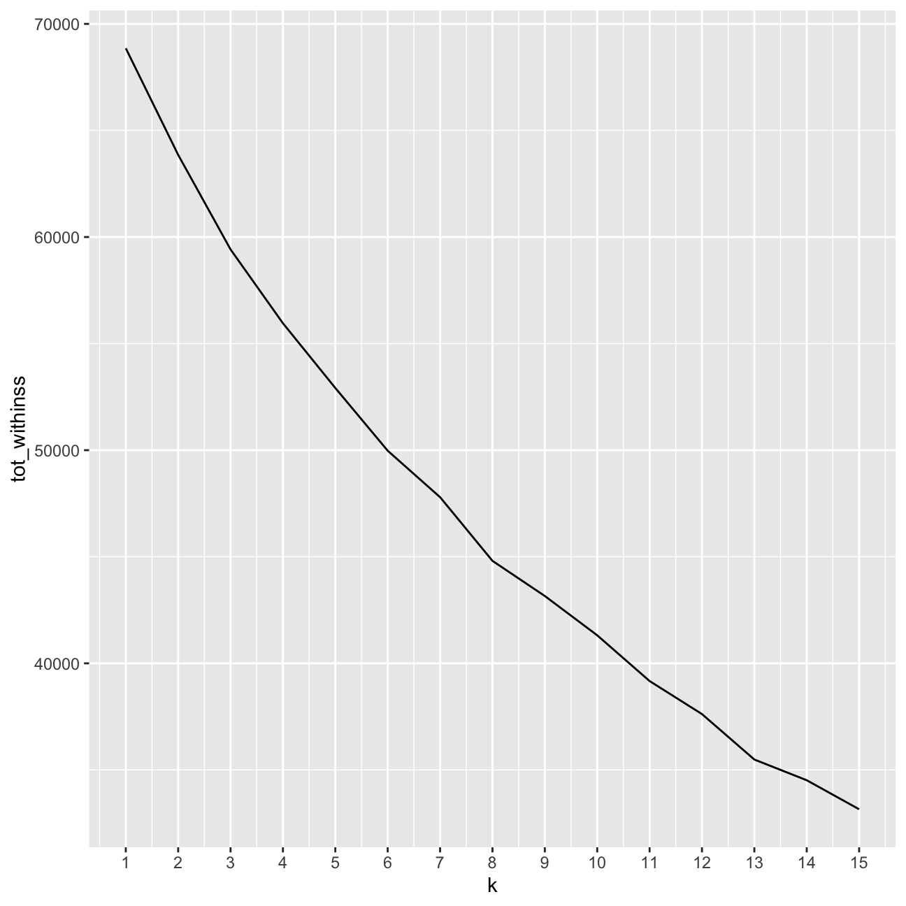
#Looking for the elbow
fviz_nbclust(userdata_red_select,kmeans, method = "wss",k.max=15)+
  labs(subtitle = "Elbow method")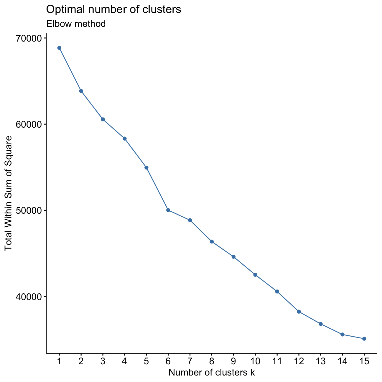
It is not entirely clear what the exact number of k clusters is optimally. I want to determine the point where the slope of the line diminishes. I can see this happening around 3/4 clusters, as well as at 6 clusters.
Silhouette method
I will repeat the previous step for Silhouette analysis.
#Silhouette analysis
fviz_nbclust(userdata_red_select, kmeans, method = "silhouette",k.max = 15)+labs(subtitle = "Silhouette method")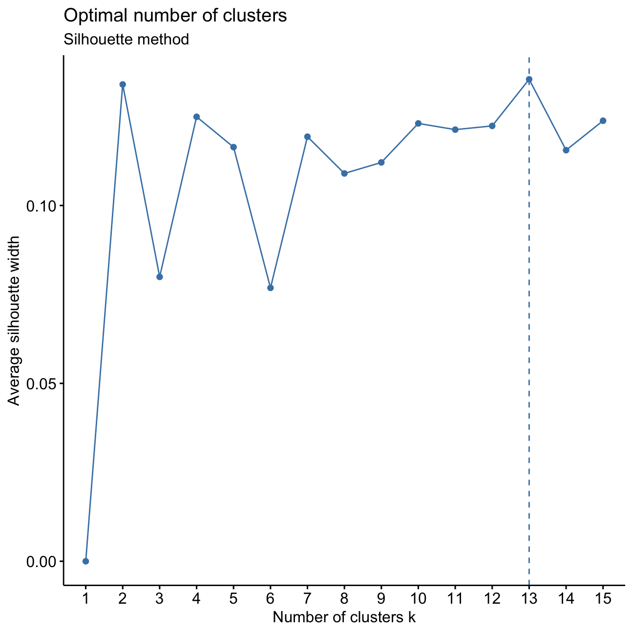
I can see from the peaks of the plotted line that the optimal number of clusters k would be 2, 4, or 13. For simplicity reasons, I should investigate 3 to 5 k clusters.
Conclusions of Elbow Chart and Silhoutte analysis
I found that the elbow chart pointed towards a cluster number of 3/4 or 6. When I conducted a silhouette analysis I saw that all the width values are positive, but also that there was a decrease in the average silhouette width at 6 clusters.
Combining the insights from these two methods, a plausible range for the number of clusters is 2 to 5.
Comparing k-means with different k
For simplicity let’s focus on lower values. Now I will find the clusters using kmeans for k=3, 4 and 5.
I will plot the centers and check the number of observations in each cluster. Then, based on these graphs I will determine which one seems to be more plausible and determine cluster sizes for all the cases.
#Fit kmeans models
model_km3 <- eclust(userdata_red_select, "kmeans", k = 3,nstart = 50, graph = FALSE)
model_km3$size
## [1] 2110 1336 179model_km4 <- eclust(userdata_red_select, "kmeans", k = 4,nstart = 50, graph = FALSE)
model_km4$size## [1] 1146 823 1476 180model_km5 <- eclust(userdata_red_select, "kmeans", k = 5,nstart = 50, graph = FALSE)
model_km5$size## [1] 182 704 805 1072 862#PCA visualizations
p3 <- fviz_cluster(model_km3, geom = "point", data = userdata_red_select, alpha=0.03, ggtheme = theme_minimal()) + ggtitle("k = 3")
p4 <- fviz_cluster(model_km4, geom = "point", data = userdata_red_select, alpha=0.03, ggtheme = theme_minimal()) + ggtitle("kmeans, k = 4")
p5 <- fviz_cluster(model_km5, geom = "point", data = userdata_red_select, alpha=0.03, ggtheme = theme_minimal()) + ggtitle("k = 5")
library(gridExtra)
grid.arrange(p3,p4,p5, nrow = 2)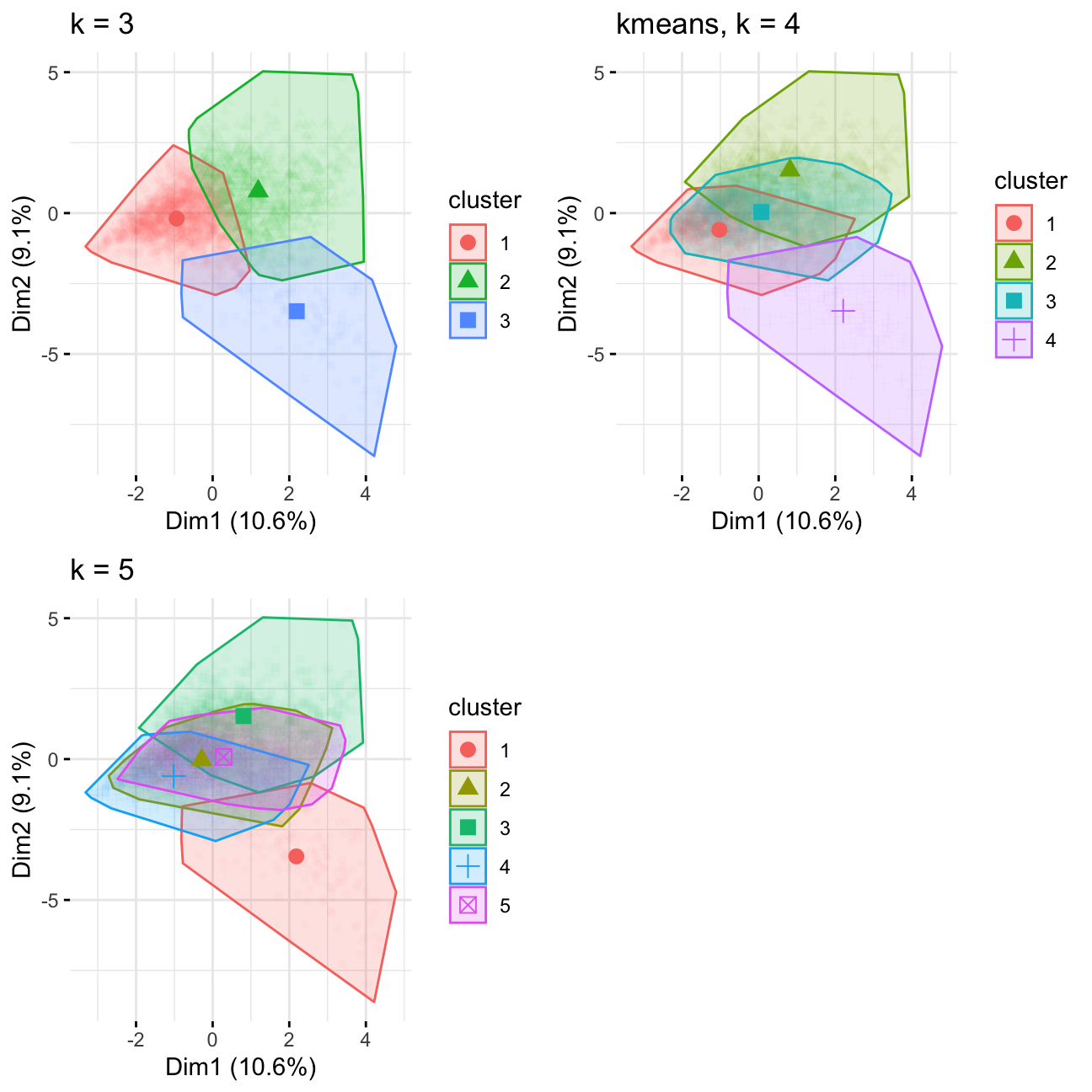
Notes: 4 looks good, judging by the size of cluster it divides the group in k=3 into 2 subgroups, 5 has too much overlap
#Plot centers for k =3

cluster_centers<-data.frame(cluster=as.factor(c(1:3)),model_km3$centers)

#transpose this data frame
cluster_centers_t<-cluster_centers %>% gather(variable,value,-cluster,factor_key = TRUE)

#plot the centers
graphkmeans_3clusters<-ggplot(cluster_centers_t, aes(x = variable, y = value))+  geom_line(aes(color =cluster,group = cluster), linetype = "dashed",size=1)+ geom_point(size=1,shape=4)+geom_hline(yintercept=0)+theme(text = element_text(size=10),
        axis.text.x = element_text(angle=45, hjust=1),)+ggtitle("K-means Centers k=3")

#Plot centers for k =4
cluster_centers<-data.frame(cluster=as.factor(c(1:4)),model_km4$centers)

#transpose this data frame
cluster_centers_t<-cluster_centers %>% gather(variable,value,-cluster,factor_key = TRUE)

#plot the centers
graphkmeans_4clusters<-ggplot(cluster_centers_t, aes(x = variable, y = value))+  geom_line(aes(color =cluster,group = cluster), linetype = "dashed",size=1)+ geom_point(size=1,shape=4)+geom_hline(yintercept=0)+theme(text = element_text(size=10),
        axis.text.x = element_text(angle=45, hjust=1),)+ggtitle("K-means Centers k=4")


#Plot centers for k =5
cluster_centers<-data.frame(cluster=as.factor(c(1:5)),model_km5$centers)

#transpose this data frame
cluster_centers_t<-cluster_centers %>% gather(variable,value,-cluster,factor_key = TRUE)

#plot the centers
graphkmeans_5clusters<-ggplot(cluster_centers_t, aes(x = variable, y = value))+  geom_line(aes(color =cluster,group = cluster), linetype = "dashed",size=1)+ geom_point(size=1,shape=4)+geom_hline(yintercept=0)+theme(text = element_text(size=10),
        axis.text.x = element_text(angle=45, hjust=1),)+ggtitle("K-means Centers k=5")


grid.arrange(graphkmeans_3clusters,graphkmeans_4clusters,graphkmeans_5clusters, nrow = 2)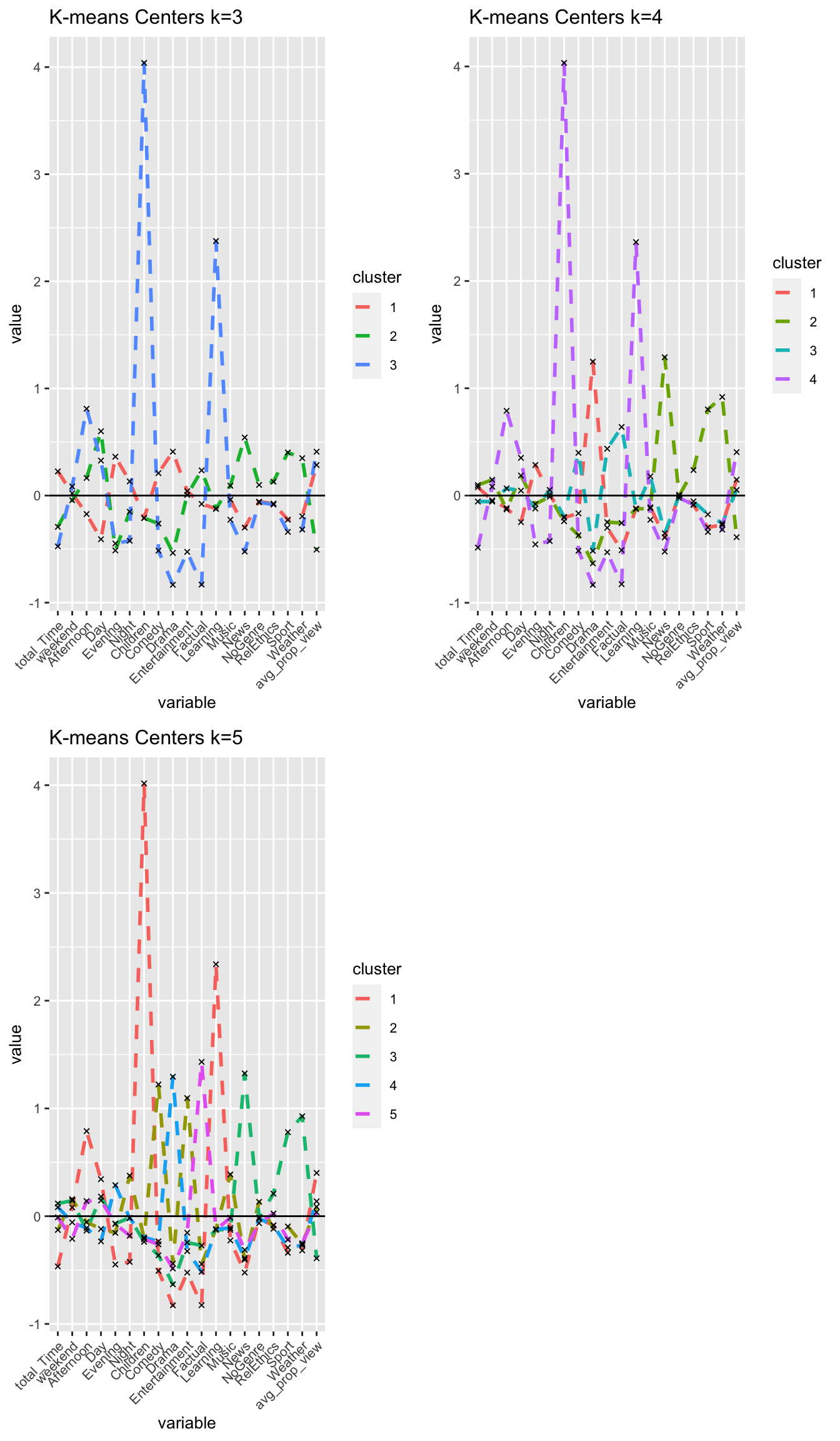
I confirm that I choose k = 4 clusters.
Comparing results of different clustering algorithms
PAM
I will fit a PAM model for the k value I chose above for k-means and determine how many points each cluster has.
#PAM model with k 3-5
k3_pam <-eclust(userdata_red_select, "pam", k = 3, graph = FALSE)
k4_pam <-eclust(userdata_red_select, "pam", k = 4, graph = FALSE)
k5_pam <-eclust(userdata_red_select, "pam", k = 5, graph = FALSE)

#Let's see the cluster sizes
k3_pam$clusinfo
## size max_diss av_diss diameter separation
## [1,] 1551 17.8 3.81 25.3 0.497
## [2,] 835 15.9 4.39 21.8 0.609
## [3,] 1239 34.5 3.42 37.6 0.497k4_pam$clusinfo## size max_diss av_diss diameter separation
## [1,] 1447 17.8 3.57 25.3 0.497
## [2,] 810 15.9 4.31 21.8 1.040
## [3,] 1201 34.5 3.30 36.5 0.497
## [4,] 167 16.5 4.72 18.9 1.638k5_pam$clusinfo## size max_diss av_diss diameter separation
## [1,] 747 17.8 2.90 20.0 0.626
## [2,] 468 14.2 3.68 18.2 1.162
## [3,] 1062 17.6 4.14 23.7 0.283
## [4,] 1181 34.5 3.38 36.5 0.283
## [5,] 167 16.5 4.73 18.9 1.638I will plot the centers of the clusters and produce PCA visualization.
#center of the clusters

  #Plot for k =3
#First generate a new data frame with cluster medoids and cluster numbers
cluster_medoids<-data.frame(cluster=as.factor(c(1:3)),k3_pam$medoids)

#transpose this data frame
cluster_medoids_t<-cluster_medoids %>% gather(variable,value,-cluster,factor_key = TRUE)

#plot medoids
graphkmeans_3Pam<-ggplot(cluster_medoids_t, aes(x = variable, y = value))+  geom_line(aes(color =cluster,group = cluster), linetype = "dashed",size=1)+ geom_point(size=1,shape=4)+geom_hline(yintercept=0)+theme(text = element_text(size=10),
        axis.text.x = element_text(angle=45, hjust=1),)+ggtitle("Pam Medoids k=3")

  #Plot for k =3
#First generate a new data frame with cluster medoids and cluster numbers
cluster_medoids<-data.frame(cluster=as.factor(c(1:4)),k4_pam$medoids)

#transpose this data frame
cluster_medoids_t<-cluster_medoids %>% gather(variable,value,-cluster,factor_key = TRUE)

#plot medoids
graphkmeans_4Pam<-ggplot(cluster_medoids_t, aes(x = variable, y = value))+  geom_line(aes(color =cluster,group = cluster), linetype = "dashed",size=1)+ geom_point(size=1,shape=4)+geom_hline(yintercept=0)+theme(text = element_text(size=10),
        axis.text.x = element_text(angle=45, hjust=1),)+ggtitle("Pam Medoids k=4")

  #Plot for k =5
#First generate a new data frame with cluster medoids and cluster numbers
cluster_medoids<-data.frame(cluster=as.factor(c(1:5)),k5_pam$medoids)

#transpose this data frame
cluster_medoids_t<-cluster_medoids %>% gather(variable,value,-cluster,factor_key = TRUE)

#plot medoids
graphkmeans_5Pam<-ggplot(cluster_medoids_t, aes(x = variable, y = value))+  geom_line(aes(color =cluster,group = cluster), linetype = "dashed",size=1)+ geom_point(size=1,shape=4)+geom_hline(yintercept=0)+theme(text = element_text(size=10),
        axis.text.x = element_text(angle=45, hjust=1),)+ggtitle("Pam Medoids k=5")

grid.arrange(graphkmeans_3Pam,graphkmeans_4Pam,graphkmeans_5Pam, nrow = 2)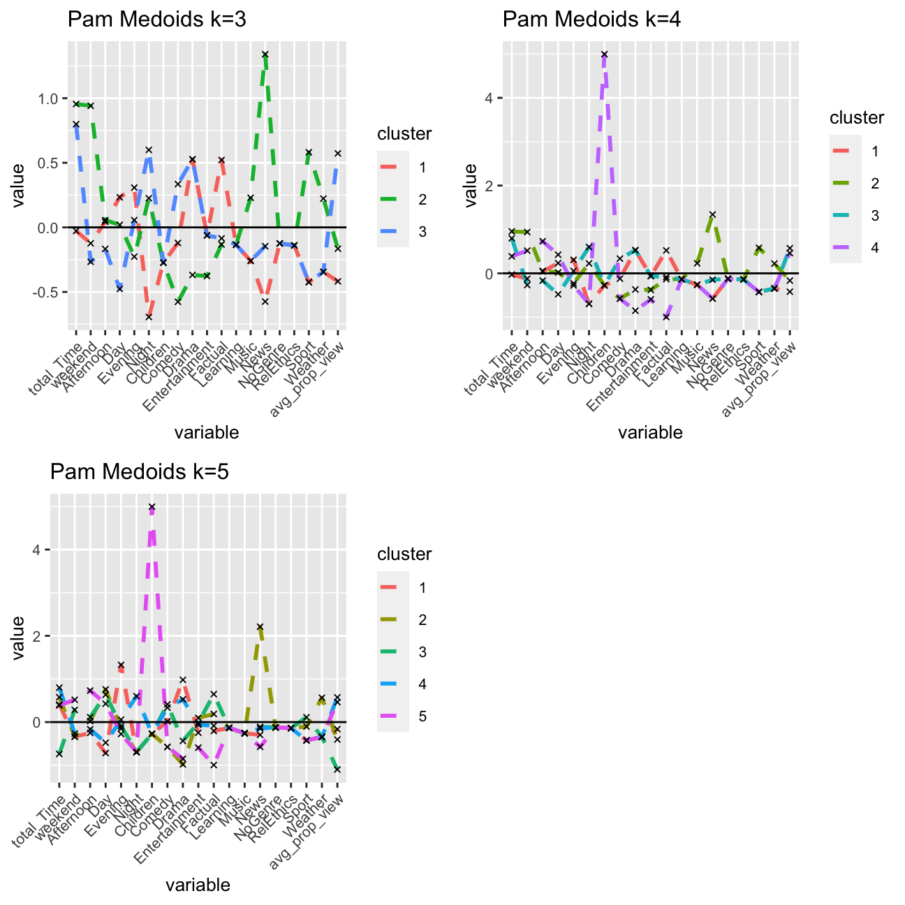
#PCA plot of PAM
pam3 <- fviz_cluster(k3_pam, geom = "point",  data = userdata_red_select, alpha=0.3, ggtheme = theme_minimal()) + ggtitle("k = 3")
pam4 <- fviz_cluster(k4_pam, geom = "point",  data = userdata_red_select, alpha=0.3, ggtheme = theme_minimal()) + ggtitle("PAM, k = 4")
pam5 <- fviz_cluster(k5_pam, geom = "point",  data = userdata_red_select, alpha=0.3, ggtheme = theme_minimal()) + ggtitle("k = 5")
library(gridExtra)
grid.arrange(pam3,pam4,pam5, nrow = 2)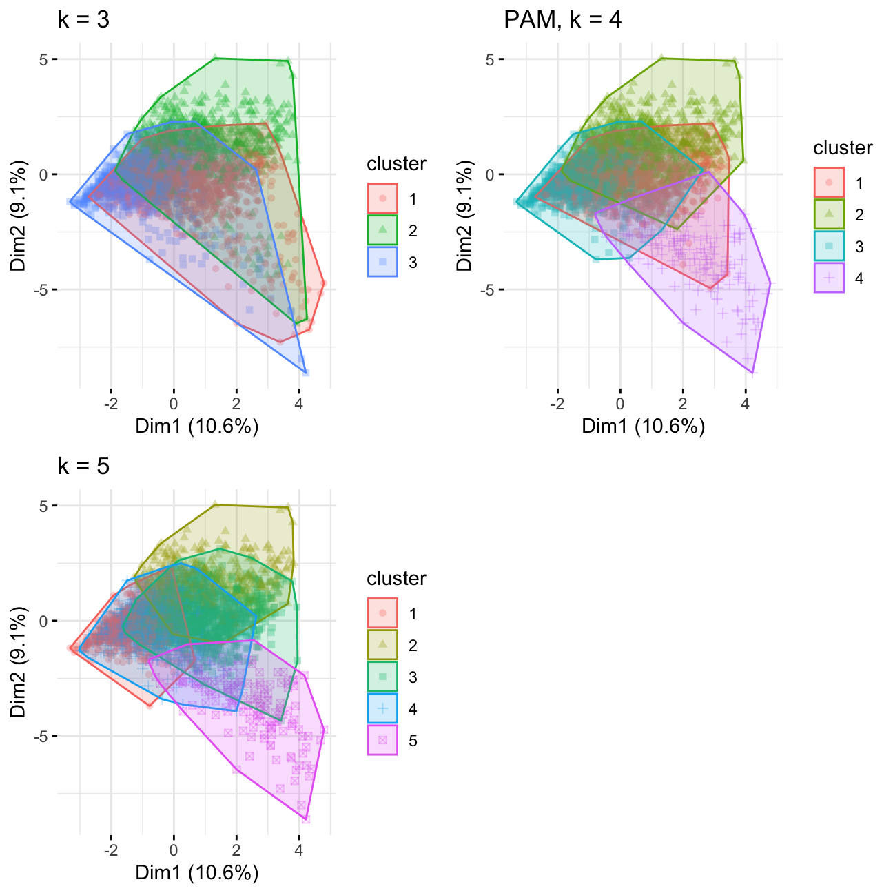
Comparing kmeans and PAM, k = 4/5 has better consistency in regards to cluster distribution. The result is less influenced by outliers compared to k=3. Looking at the other charts, I would choose k=4.
H-Clustering
I will use Hierarchical clustering with the same k I chose above. I will set hc_method equal to average and then ward.D and describe the differences observed between the results of these two methods. Then, I will visualise the results using dendrograms.
#H-Clustering, k=4
res.dist <- dist(userdata_red_select, method = "euclidean")

#Let's fit a H-Clustering methods. k is the number of clusters
#hc_method is the distance metric H-Clustering uses. See slides for more.
# we use k = 4

res.hc_avg <-  hcut(res.dist, hc_method = "average",k=4)
res.hc_war <-  hcut(res.dist, hc_method = "ward.D",k=4)
summary(res.hc_avg)
## Length Class Mode
## merge 7248 -none- numeric
## height 3624 -none- numeric
## order 3625 -none- numeric
## labels 0 -none- NULL
## method 1 -none- character
## call 3 -none- call
## dist.method 1 -none- character
## cluster 3625 -none- numeric
## nbclust 1 -none- numeric
## silinfo 3 -none- list
## size 4 -none- numeric
## data 6568500 dist numericsummary(res.hc_war)## Length Class Mode
## merge 7248 -none- numeric
## height 3624 -none- numeric
## order 3625 -none- numeric
## labels 0 -none- NULL
## method 1 -none- character
## call 3 -none- call
## dist.method 1 -none- character
## cluster 3625 -none- numeric
## nbclust 1 -none- numeric
## silinfo 3 -none- list
## size 4 -none- numeric
## data 6568500 dist numeric#size of the clusters
res.hc_avg$size## [1] 3622 1 1 1res.hc_war$size## [1] 1770 900 787 168#visulize the result with dendrograms
plot(res.hc_avg,hang = -1, cex = 0.5)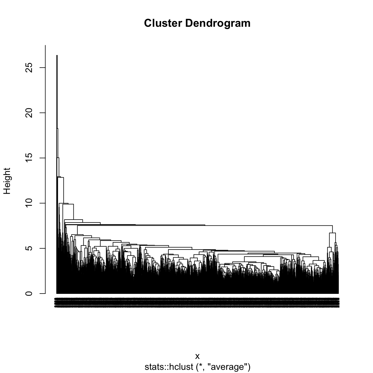
plot(res.hc_war,hang = -1, cex = 0.5)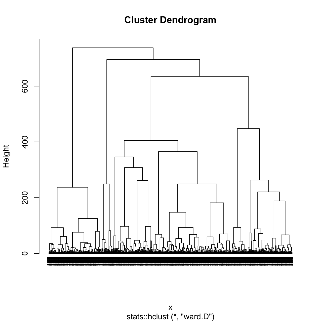
I found that Ward is the better method because the sizes of clusters are more even / constant.
The 4 clusters in the average method plot are shown to have sizes of 3622, 1, 1, and 1. It does not do well in finding segments or clusters, grouping almost all into one large cluster.
The 4 clusters in the Ward method plot are shown to have sizes of 1770, 900, 787, and 168.
I will now plot the centers of H-clusters and compare the results with K-Means and PAM.
#center of the clusters

  #Plot centers for res.hc_avg
#First let's find the averages of the variables by cluster
userdata_red_select_withClusters<-mutate(userdata_red_select,
                                   cluster = as.factor(res.hc_avg$cluster))

center_locations <- userdata_red_select_withClusters%>% group_by(cluster) %>% summarize_at(vars(total_Time:avg_prop_view),mean)

#Next I use gather to collect information together
xa2<- gather(center_locations, key = "variable", value = "value",-cluster,factor_key = TRUE)

#Next I use ggplot to visualize centers
hclust_avg_center<- ggplot(xa2, aes(x = variable, y = value,order=cluster)) +
  geom_line(aes(color = cluster,group = cluster), linetype = "dashed",size=1) + geom_point(size=2,shape=4)+geom_hline(yintercept=0) +
  ggtitle("H-clust avg")+labs(fill = "Cluster")+scale_colour_manual(values = c("darkgreen", "orange", "red","blue")) +
theme(text = element_text(size=10),
        axis.text.x = element_text(angle=45, hjust=1),)

  #Plot centers for res.hc_war
#First let's find the averages of the variables by cluster
userdata_red_select_withClusters<-mutate(userdata_red_select,
                                   cluster = as.factor(res.hc_war$cluster))

center_locations <- userdata_red_select_withClusters%>% group_by(cluster) %>% summarize_at(vars(total_Time:avg_prop_view),mean)

#Next I use gather to collect information together
xa2<- gather(center_locations, key = "variable", value = "value",-cluster,factor_key = TRUE)

#Next I use ggplot to visualize centers
hclust_ward_center<-ggplot(xa2, aes(x = variable, y = value,order=cluster)) +
  geom_line(aes(color = cluster,group = cluster), linetype = "dashed",size=1) +
  geom_point(size=2,shape=4)+geom_hline(yintercept=0)+ggtitle("H-clust ward") +
  labs(fill = "Cluster") +
  scale_colour_manual(values = c("darkgreen", "orange", "red","blue")) +
  theme(text = element_text(size=10),
        axis.text.x = element_text(angle=45, hjust=1),)

grid.arrange(hclust_avg_center,hclust_ward_center, nrow = 2)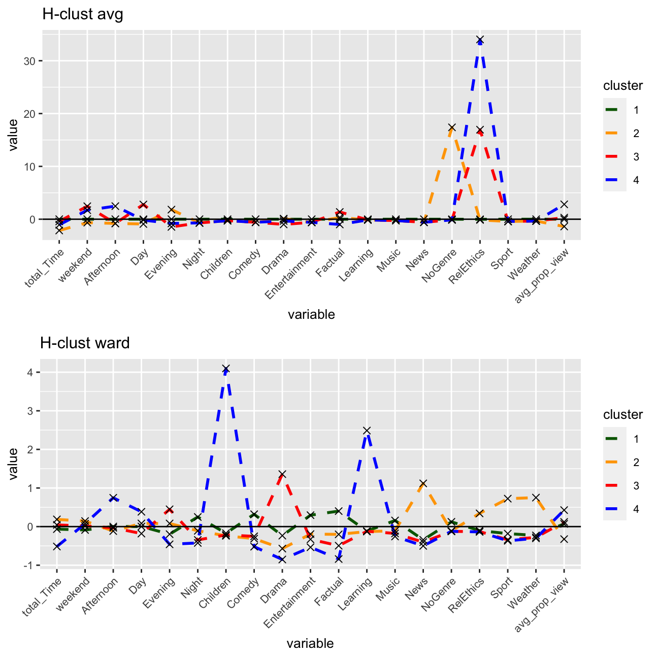
#PCA plot
Hward_4 <- fviz_cluster(res.hc_war, geom = "point",  data = userdata_red_select, alpha=0.3, ggtheme = theme_minimal()) + ggtitle("H-clustering with ward method, k=4")

#comparing kmeans, PAM, H-clustering

grid.arrange(p4, pam4 ,Hward_4, nrow = 3)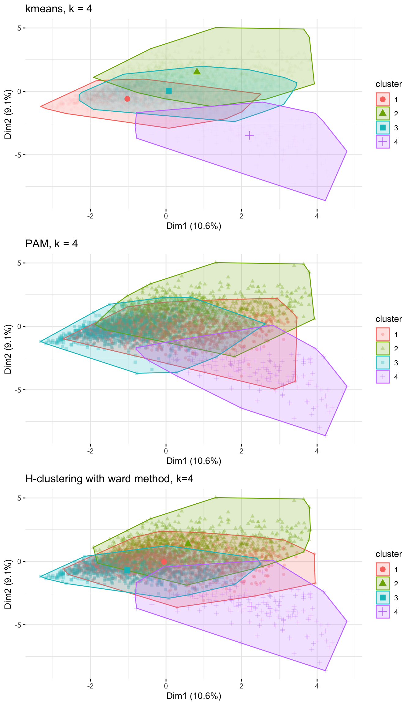
Conclusions on the 4 methods
Based on the above, I feel supported in my decision of including k=4 clusters. I see a very similar breakdown of the clusters for all of the three methods.
I see that Cluster 4, my proposed educational group, stands out the most having the least overlap with the other three clusters. It makes sense that there is an overlap between the other clusters, as many people likely consume a range of genres and do not exhibit such unique viewing habits that their in-group / cluster would be so distinct from the rest.
Subsample check
At this stage, as I have chosen the number of clusters, I will try to reinforce my conclusions and verify that they are not due to chance by dividing the data into two equal parts.
For this, I will use K-means clustering with 4 clusters, in these two data sets separately. If I get similar looking clusters, I can rest assured that my conclusions are robust.
library(rsample)
set.seed(1234)
train_test_split <- initial_split(userdata_red_select, prop = 0.5)
testing <- testing(train_test_split) #50% of the data is set aside for testing
training <- training(train_test_split) #50% of the data is set aside for training

#Fit k-means to each dataset and compare results
model_kmeans_training<-eclust(training, "kmeans", k = 4,nstart = 50, graph = FALSE)
model_kmeans_testing<-eclust(testing, "kmeans", k = 4,nstart = 50, graph = FALSE)
p_train <- fviz_cluster(model_kmeans_training, geom = "point",  data = training, alpha=0.018, ggtheme = theme_minimal()) + ggtitle("Training verification")
p_test <- fviz_cluster(model_kmeans_testing, geom = "point",  data = testing, alpha=0.018, ggtheme = theme_minimal()) + ggtitle("Testing verification")

grid.arrange(p_train, p_test, nrow = 1)
Conclusions on the subsample
The training and testing clusters do look similar if I neglect the colour (which is not important anyway because order of clusters don’t matter). With both training and testing sets, roughly the same clusters were derived, even with minor differences and clusters 2 and 1 being switched in the testing verification. I am more confident in the results now.
Final conclusions
Characteristics of clusters
I am most confident about my educational group of young users, that mainly watch in the day and afternoon time, and watch educational programs.
I can also identify roughly the attributes of the other three clusters: cluster one being the drama group (watching more drama in the evenings), cluster two being the functional group (watch more sports and news during the day, don’t often finish shows they watch), and cluster three being the entertainment group (watch more informational intensive shows and don’t have a clear time pattern).
It is this last cluster (cluster 3 in k-means) that I am least sure about, as the viewing habits exhibit no clear pattern there is the greatest overlap with other user groups.
Choice of k
I do think I chose the right number of clusters based on my analysis using different methods. I combined the inputs of both elbow and silhouette methods to determine this number, and also looked at the cluster centers and PCA plots.
With more data, e.g. over a longer time period, the viewing habits (especially for cluster 3 which has less of a clear pattern as marked by cluster centers) may become clearer, but ultimately the choice of cluster is appropriate in my opinion.
Assupmtions needed
K-means assumes that the variance of the distribution of each attribute (variable) is isotropic. Also the prior for all clusters are the same. If any one of these 2 assumptions is violated, then k-means will fail. Also, I am assuming only one person use per account, or else data of the whole family would be aggregated under on user_id. I also assume people are actively watching BBC during viewing time, instead of putting BBC as a background noise. I could either apply my findings and analyse before-and-after viewer satisfaction data. Splitting the data into two random halves and testing my clusters to see whether a relatively consistent clustering pattern exists.
Purpose and use of the above clusters
As established above,I have clustered the users of the BBC iPlayer into 4 groups that I identified as the following: drama, functional, entertainment, and educational. The range of visualizations throughout my analysis showed that the most distinct segment here are the (young) educational users. BBC should ensure to have a steady pipeline of quality educational content for these users. Not only does this fulfill their mission of educating and engaging with the UK population, but developing customer loyalty with users at a young age this way ensures that BBC has a pipeline of adult users in return. Though the iPlayer offers content on demand, educational content that is broadcast on TV should be scheduled around typical school times. Regarding the drama group, this cluster illustrates the viewing behavior of watching drama content in the evenings. The existence of this group is the reason why other TV channels typically show dramas and blockbuster movies at “prime-time”, around 8 pm. BBC should ensure a varying offering of content in this genre, and enhance the recommendation engines of the iPlayer to suggest content other users in this cluster liked that the individual has not seen before. This last notion, of improving recommendation engines based on identified clusters, is a general business recommendation to consider. A last observation to note is that the functional group do not often finish the show they watch (mostly sports and news), meaning that their engagement is not high. A customer analysis could be performed here, with focus groups and/or interviews revealing deeper insights into this least engaged group’s behavior, as well as a quantitative analysis of the “bounce rate” or point where most users stop watching. It would further be useful to try to get users in this cluster to engage with different kind of content based on their interest; perhaps movies that are sports related (e.g. Moneyball, documentaries on legendary sports players) for those only or mainly consuming content of the sports genre.
