Gapminder Data Analisys - Data & Correlation Analysis
Gapminder data introduction
The Gapminder data is known worldwide thanks to Hans Rosling and his webstie data in Gapminder World. The data downloaded from the website was cut into the data frame that contains just six columns from the larger . In this part, I will join a few dataframes with more data than the ‘gapminder’ package. Specifically, I will look at data on
- Life expectancy at birth (life_expectancy_years.csv)
- GDP per capita in constant 2010 US$ (https://data.worldbank.org/indicator/NY.GDP.PCAP.KD)
- Female fertility: The number of babies per woman (https://data.worldbank.org/indicator/SP.DYN.TFRT.IN)
- Primary school enrollment as % of children attending primary school (https://data.worldbank.org/indicator/SE.PRM.NENR)
- Mortality rate, for under 5, per 1000 live births (https://data.worldbank.org/indicator/SH.DYN.MORT)
- HIV prevalence (adults_with_hiv_percent_age_15_49.csv): The estimated number of people living with HIV per 100 population of age group 15-49.
For this, I will use the wbstats package to download data from the World Bank. The relevant World Bank indicators are SP.DYN.TFRT.IN, SE.PRM.NENR, NY.GDP.PCAP.KD, and SH.DYN.MORT
I will join the 3 dataframes (life_expectancy, worldbank_data, and HIV) into one. I will tidy my data first and then perform join operations.
To join all the 3 dataframes I use left.join in order to keep our data tidy. On the left side of the “data” dataframe we can find all the categorical variables that describe our data. On the right side, we can find numerical variables.
# load gapminder HIV data
hiv <- adults_with_hiv_percent_age_15_49 <- read_csv("~/Documents/Applied Statistics in R/homeworks/data/adults_with_hiv_percent_age_15_49.csv")
life_expectancy <- life_expectancy_years <- read_csv("~/Documents/Applied Statistics in R/homeworks/data/life_expectancy_years.csv")

# get World bank data using wbstats
indicators <- c("SP.DYN.TFRT.IN","SE.PRM.NENR", "SH.DYN.MORT", "NY.GDP.PCAP.KD")


library(wbstats)

worldbank_data <- wb_data(country="countries_only",
                          indicator = indicators,
                          start_date = 1960,
                          end_date = 2016) %>% rename(year=date)
# get a dataframe of information regarding countries, indicators, sources, regions, indicator topics, lending types, income levels, from the World Bank API
countries <- wbstats::wb_cachelist$countries
data <- left_join(countries, worldbank_data, by="country")
Life_expectancy_longer<- life_expectancy %>%
pivot_longer(!country,names_to= "year",
values_to= "count")
hiv_longer<- hiv %>%
pivot_longer(!country,names_to= "year",
values_to= "count")
big_df<- left_join(hiv_longer,
Life_expectancy_longer,
by=c("country","year")) %>%
transform(year=as.numeric(year))
big_df_cleaned<- left_join(data,
big_df,
by=c("country","year"))
big_df_cleaned<- big_df_cleaned %>%
rename(hiv_count=count.x,
life_expectancy=count.y)glimpse(big_df_cleaned)## Rows: 12,456
## Columns: 27
## $ iso3c.x <chr> "ABW", "ABW", "ABW", "ABW", "ABW", "ABW", "ABW", "…
## $ iso2c.x <chr> "AW", "AW", "AW", "AW", "AW", "AW", "AW", "AW", "A…
## $ country <chr> "Aruba", "Aruba", "Aruba", "Aruba", "Aruba", "Arub…
## $ capital_city <chr> "Oranjestad", "Oranjestad", "Oranjestad", "Oranjes…
## $ longitude <dbl> -70, -70, -70, -70, -70, -70, -70, -70, -70, -70, …
## $ latitude <dbl> 12.5, 12.5, 12.5, 12.5, 12.5, 12.5, 12.5, 12.5, 12…
## $ region_iso3c <chr> "LCN", "LCN", "LCN", "LCN", "LCN", "LCN", "LCN", "…
## $ region_iso2c <chr> "ZJ", "ZJ", "ZJ", "ZJ", "ZJ", "ZJ", "ZJ", "ZJ", "Z…
## $ region <chr> "Latin America & Caribbean", "Latin America & Cari…
## $ admin_region_iso3c <chr> NA, NA, NA, NA, NA, NA, NA, NA, NA, NA, NA, NA, NA…
## $ admin_region_iso2c <chr> NA, NA, NA, NA, NA, NA, NA, NA, NA, NA, NA, NA, NA…
## $ admin_region <chr> NA, NA, NA, NA, NA, NA, NA, NA, NA, NA, NA, NA, NA…
## $ income_level_iso3c <chr> "HIC", "HIC", "HIC", "HIC", "HIC", "HIC", "HIC", "…
## $ income_level_iso2c <chr> "XD", "XD", "XD", "XD", "XD", "XD", "XD", "XD", "X…
## $ income_level <chr> "High income", "High income", "High income", "High…
## $ lending_type_iso3c <chr> "LNX", "LNX", "LNX", "LNX", "LNX", "LNX", "LNX", "…
## $ lending_type_iso2c <chr> "XX", "XX", "XX", "XX", "XX", "XX", "XX", "XX", "X…
## $ lending_type <chr> "Not classified", "Not classified", "Not classifie…
## $ iso2c.y <chr> "AW", "AW", "AW", "AW", "AW", "AW", "AW", "AW", "A…
## $ iso3c.y <chr> "ABW", "ABW", "ABW", "ABW", "ABW", "ABW", "ABW", "…
## $ year <dbl> 1960, 1961, 1962, 1963, 1964, 1965, 1966, 1967, 19…
## $ NY.GDP.PCAP.KD <dbl> NA, NA, NA, NA, NA, NA, NA, NA, NA, NA, NA, NA, NA…
## $ SE.PRM.NENR <dbl> NA, NA, NA, NA, NA, NA, NA, NA, NA, NA, NA, NA, NA…
## $ SH.DYN.MORT <dbl> NA, NA, NA, NA, NA, NA, NA, NA, NA, NA, NA, NA, NA…
## $ SP.DYN.TFRT.IN <dbl> 4.82, 4.66, 4.47, 4.27, 4.06, 3.84, 3.62, 3.42, 3.…
## $ hiv_count <dbl> NA, NA, NA, NA, NA, NA, NA, NA, NA, NA, NA, NA, NA…
## $ life_expectancy <dbl> NA, NA, NA, NA, NA, NA, NA, NA, NA, NA, NA, NA, NA…What is the relationship between HIV prevalence and life expectancy?
I will examine now the relationship between HIV prevalance and life expectancy. I will look at the trend progressing in time.
big_df_cleaned_1990 <- big_df_cleaned %>%
  filter(year>1989& year <2012)
ggplot(big_df_cleaned_1990,
       aes(x=life_expectancy,
           y=hiv_count,
           colour= region)) +
 facet_wrap(~year,
            scales="free")+
geom_point() +
geom_smooth(colour="blue") +
 theme_bw() +
  labs (
    title = "Over time the relationship between HIV prevalance and \nlife expectancy is getting stronger - the less HIV prevalence, \nthe higher the life expectancy",
    subtitle = "Relationship between HIV prevalence and life expectancy",
    x= "Life expectancy",
    y= "HIV prevalence"
  )+
   theme(panel.grid.major.y = element_line(color = "gray60", size = 0.1),
        strip.text= element_text(family="Montserrat", face = "plain"),
        panel.background = element_rect(fill = "white", colour = "white"),
        axis.line = element_line(size = 1, colour = "grey80"),
        axis.ticks = element_line(size = 3,colour = "grey80"),
        axis.ticks.length = unit(.20, "cm"),
        plot.title = element_text(color = "black",size=13,face="bold", family= "Montserrat"),
        plot.subtitle = element_text(color = "black",size=12,face="plain", family= "Montserrat"),
        axis.title.y = element_text(size = 8, angle = 90, family="Montserrat", face = "plain"),
        axis.text.y=element_text(family="Montserrat", size=7),
        axis.title.x = element_text(size = 8, family="Montserrat", face = "plain"),
        axis.text.x=element_text(family="Montserrat", size=7),
        legend.text=element_text(family="Montserrat", size=7),
        legend.title=element_text(family="Montserrat", size=8, face="bold"))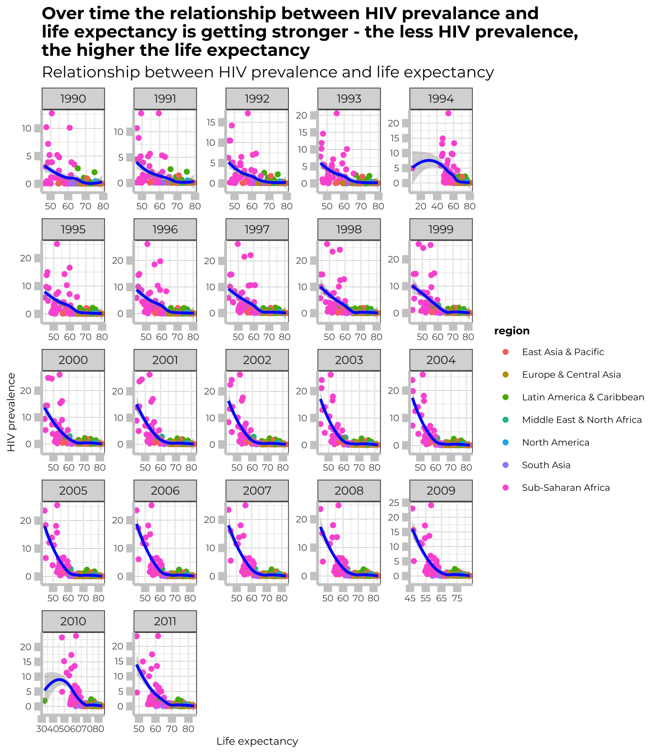
As we can conclude from the graph, over years the relationship between HIV prevalence and life expectancy is getting stronger. In countries where HIV prevalance is the highest, it has risen for years, while life expectancy has not noticed such a significant growth. Also, we can notice, that for years, the Sub-Saharan Africa has had the biggest scale of the problem.
What is the relationship between fertility rate and GDP per capita?
Let’s have a look now at the correlation between fertility rate and GDp per capita in particular reserached regions.
by_region <- big_df_cleaned %>%
  group_by(region) %>%
filter(region!="Aggregates")
ggplot(by_region, aes(x=SP.DYN.TFRT.IN,
                      y=NY.GDP.PCAP.KD) ) +
    scale_y_continuous(name="NY.GDP.PCAP.KD",labels= scales::comma)+
facet_wrap(~region,
           scales="free")+
  geom_point(alpha=0.04) +
  scale_y_log10() +
  geom_smooth(method="loess") +
 theme_bw() +
  labs (
    title = "Generally, the higher GDP per capita, the lower ferility rate",
    subtitle = "Relationship between height of GDP per capita and fertility rate",
    x= "Fertility rate",
    y= "GDP per capita"
  ) +
   theme(panel.grid.major.y = element_line(color = "gray60", size = 0.1),
        strip.text= element_text(family="Montserrat", face = "plain"),
        panel.background = element_rect(fill = "white", colour = "white"),
        axis.line = element_line(size = 1, colour = "grey80"),
        axis.ticks = element_line(size = 3,colour = "grey80"),
        axis.ticks.length = unit(.20, "cm"),
        plot.title = element_text(color = "black",size=13,face="bold", family= "Montserrat"),
        plot.subtitle = element_text(color = "black",size=12,face="plain", family= "Montserrat"),
        axis.title.y = element_text(size = 8, angle = 90, family="Montserrat", face = "plain"),
        axis.text.y=element_text(family="Montserrat", size=6),
        axis.title.x = element_text(size = 8, family="Montserrat", face = "plain"),
        axis.text.x=element_text(family="Montserrat", size=6),
        legend.text=element_text(family="Montserrat", size=6),
        legend.title=element_text(family="Montserrat", size=6, face="bold"),
        legend.position = "none")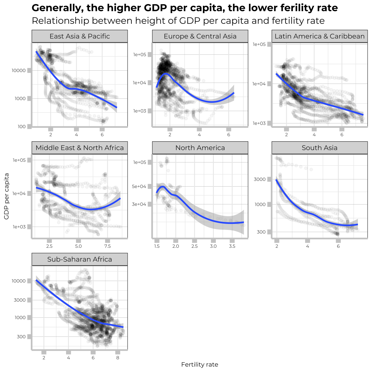
We can notice from the graph that in richer countries the fertility, tends to be lower. However, the important factor here is to remember about the free scales of the graphs presented. Even though, the same trend is visible across all the regions, it is much stronger in developed regions than in the poor ones.
Which regions have the most observations with missing HIV data?
In order to better understand the data, I need to examine the missing values of particular variables. In this chunk, I will look at the missing values regarding HIV across particular regions.
#Add regions to the hiv_longer dataframe, selecting all relevant variables, renaming the count variable to make it clearer

hiv_longer_region <- left_join(hiv_longer,
                               countries,
                               by = "country") %>%
  select(region,
         country,
         year,
         count) %>%
  rename(hiv_count_per100=count)

#Count the number of NA values per region
hiv_longer_region <- hiv_longer_region %>%
  group_by(region) %>%
  summarise_all(~sum(is.na(.))) %>%
  transmute(region, total_NA_per_region = rowSums(.[-1]))

hiv_longer_region
## # A tibble: 8 x 2
## region total_NA_per_region
## <chr> <dbl>
## 1 East Asia & Pacific 179
## 2 Europe & Central Asia 435
## 3 Latin America & Caribbean 258
## 4 Middle East & North Africa 105
## 5 North America 20
## 6 South Asia 108
## 7 Sub-Saharan Africa 497
## 8 <NA> 179hiv_longer_region <- hiv_longer_region %>%
na.omit(hiv_longer_region)
#Graph the total NA per region as a column chart, reordered in descending order
ggplot(hiv_longer_region, aes(y = reorder(region, total_NA_per_region), x = total_NA_per_region)) +
geom_col() +
theme_bw() +
labs(title = "Sub-saharan Africa has the lowest quality of the HIV data",
subtitle = "Comparison of total number of missing HIV data across regions", x= "Total number of missing HIV values", y= NULL) +
theme(panel.grid.major.y = element_line(color = "gray60", size = 0.1),
strip.text= element_text(family="Montserrat", face = "plain"),
panel.background = element_rect(fill = "white", colour = "white"),
axis.line = element_line(size = 1, colour = "grey80"),
axis.ticks = element_line(size = 3,colour = "grey80"),
axis.ticks.length = unit(.20, "cm"),
plot.title = element_text(color = "black",size=13,face="bold", family= "Montserrat"),
plot.subtitle = element_text(color = "black",size=12,face="plain", family= "Montserrat"),
axis.title.y = element_text(size = 8, angle = 90, family="Montserrat", face = "plain"),
axis.text.y=element_text(family="Montserrat", size=6),
axis.title.x = element_text(size = 8, family="Montserrat", face = "plain"),
axis.text.x=element_text(family="Montserrat", size=6),
legend.text=element_text(family="Montserrat", size=6),
legend.title=element_text(family="Montserrat", size=6, face="bold"))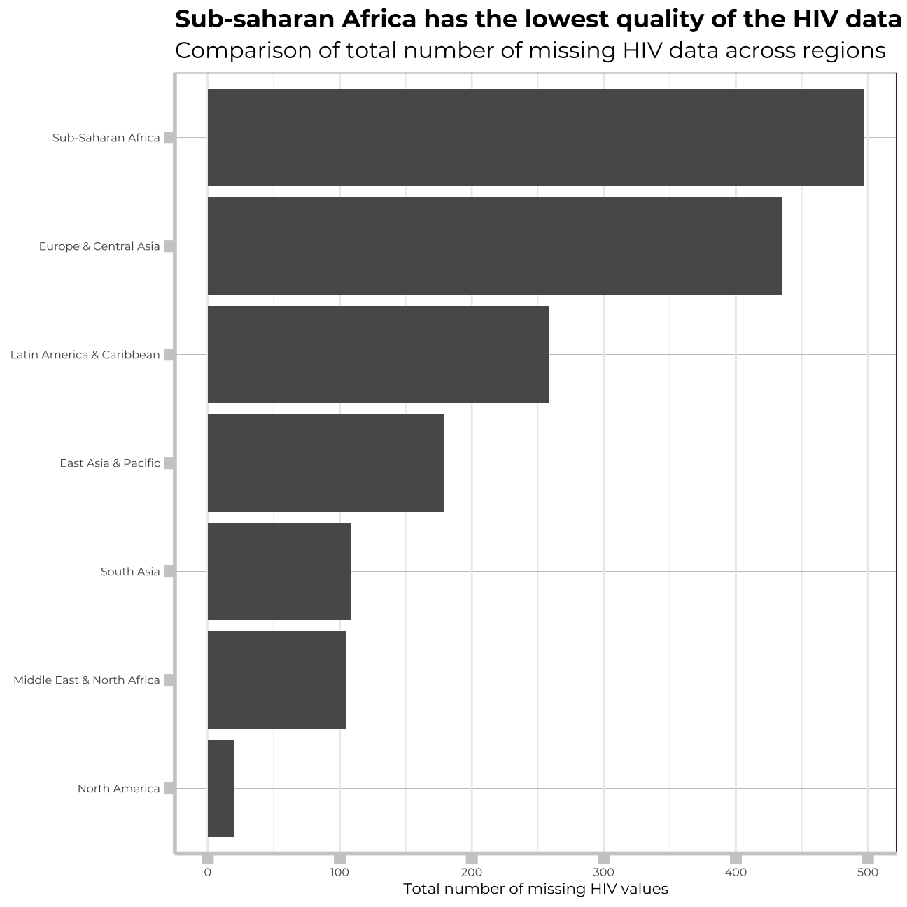 Again, the most developed regions in the world, are abundant with dasta regarding HIV. In regions, where the problem is the most severe, the data is missing in great amounts.
How has mortality rate for under 5 changed by region?
In each region, I will find the top 5 countries that have seen the greatest improvement, as well as those 5 countries where mortality rates have had the least improvement or even deterioration.
# Mortality Rate development across regions
#Create dataframe with relevant variables, excluding NA
mortality_data <- data %>%
  select(region,
         country,
         year,
         SH.DYN.MORT) %>%
  na.omit() %>%
  filter(year>1989&
           year <2012) %>%
rename("mortality_rate" = "SH.DYN.MORT")

#mortality_data #check created data frame

#Now we plot the mortality data per region

mort_by_region <- mortality_data %>%
  group_by(region) %>%
  filter(region!="Aggregates")

# Now lets find the top countries in regards to the change of mortality rate from base year 1990 to 2011

#Create data frame with relevant variables
mortality_data_country <- data %>%
  select(region,
         country,
         year,
         SH.DYN.MORT) %>%
  group_by(region) %>%
  na.omit() %>%
 filter(year== 1990 |
          year ==2011) %>%
  pivot_wider(names_from=year ,
              values_from=SH.DYN.MORT)  %>%
  rename("mortality_rate_1990" = "1990",
         "mortality_rate_2011" = "2011") %>%
  mutate(mort_diff=(mortality_rate_2011-mortality_rate_1990)/mortality_rate_1990*100) %>%
  arrange(mort_diff) %>%
  filter(region!="Aggregates")

 #Check created data frame
# mortality_data_country

#Now I create two data sets based on the new dataframe with the relative % change in mortality rate, one for the 5 biggest improvers per region and one for the 5 worst improvers

#I use slice_min as we want the largest negative values, i.e. the largest relative decreases

biggest_improvers <- mortality_data_country %>%
  group_by(region) %>%
  slice_min(mort_diff, n=5)

#biggest_improvers # check


#I use slice_max to get the largest (positive) values of the difference in mortality rate (or lowest negative numbers)

worst_improvers <- mortality_data_country %>%  # finding top 5 countries per region with the worst improvement
  group_by(region) %>%
  arrange(desc(mort_diff)) %>%
  slice_max(mort_diff, n=5)

#worst_improvers # check

# Plot for top 5 best improvement

ggplot(biggest_improvers,
       aes( x=abs(mort_diff),
            y=reorder(country,
                      abs(mort_diff)))) +
  facet_wrap(~region,
             scales = "free") +
  geom_col() +
  labs(title = "Leaders in Child Mortality reduction",
       subtitle = "Comparison of most improved countries in relative % \nchange in child mortality rates, by region",
       x = "",
       y = "Difference in mortality rate under 5 (%, 1990 vs 2011")+
 theme(panel.grid.major.y = element_line(color = "gray60", size = 0.2),
        strip.text= element_text(size=6,family="Montserrat", face = "plain"),
        panel.background = element_rect(fill = "white", colour = "white"),
        axis.line = element_line(size = 1, colour = "grey80"),
        axis.ticks = element_line(size = 3,colour = "grey80"),
        axis.ticks.length = unit(.20, "cm"),
        plot.title = element_text(color = "black",size=13,face="bold", family= "Montserrat"),
        plot.subtitle = element_text(color = "black",size=10,face="plain", family= "Montserrat"),
        axis.title.y = element_text(size = 7, angle = 90, family="Montserrat", face = "plain"),
        axis.text.y=element_text(family="Montserrat", size=6),
        axis.title.x = element_text(size = 7, family="Montserrat", face = "plain"),
        axis.text.x=element_text(family="Montserrat", size=6),
        legend.text=element_text(family="Montserrat", size=6),
        legend.title=element_text(family="Montserrat", size=6, face="bold"),
        legend.position = "none")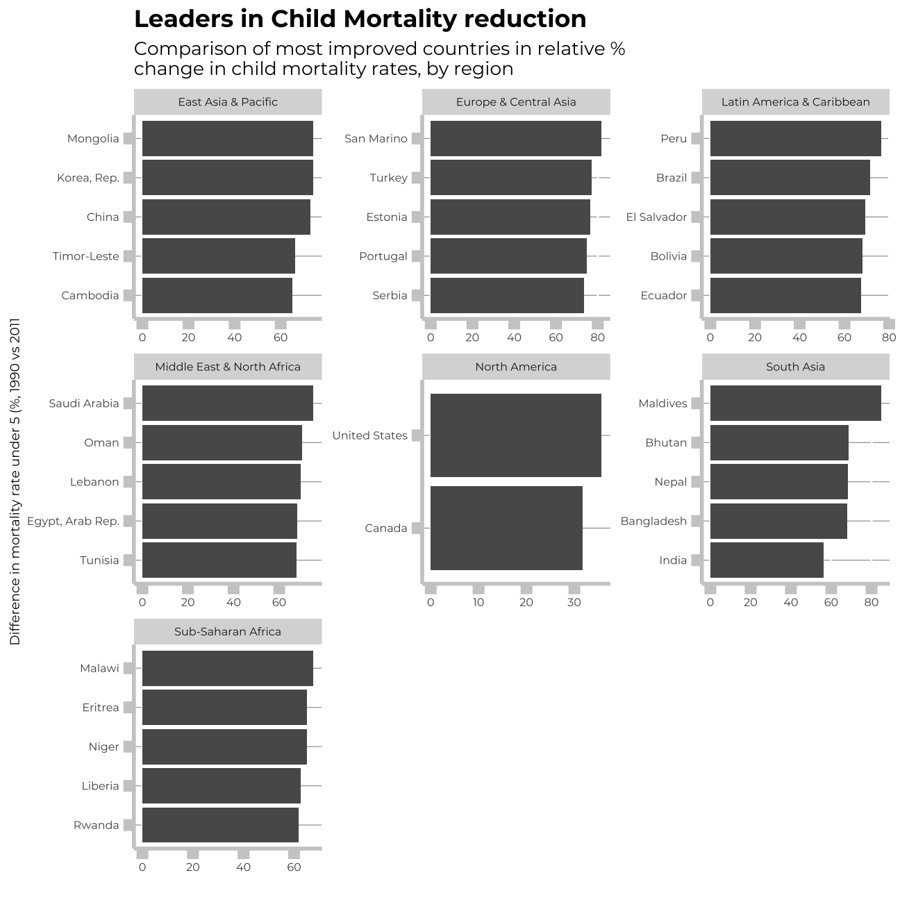
# Plot for top 5 worst improvement

ggplot(worst_improvers,
       aes(x=abs(mort_diff),
           y=reorder(country,
                     abs(mort_diff)))) +
  facet_wrap(~region,
             scales = "free") +
  geom_col() +
  labs(title = "Laggards in Child Mortality Reduction",
       subtitle = "Comparison of least improved countries in relative % \nchange in child mortality rates, by region",
       x = "",
       y = "Difference in mortality rate under 5 (%, 1990 vs 2011")+
theme(panel.grid.major.y = element_line(color = "gray60", size = 0.1),
        strip.text= element_text(size = 6,family="Montserrat", face = "plain"),
        panel.background = element_rect(fill = "white", colour = "white"),
        axis.line = element_line(size = 1, colour = "grey80"),
        axis.ticks = element_line(size = 3,colour = "grey80"),
        axis.ticks.length = unit(.20, "cm"),
        plot.title = element_text(color = "black",size=13,face="bold", family= "Montserrat"),
        plot.subtitle = element_text(color = "black",size=10,face="plain", family= "Montserrat"),
        axis.title.y = element_text(size = 7, angle = 90, family="Montserrat", face = "plain"),
        axis.text.y=element_text(family="Montserrat", size=5),
        axis.title.x = element_text(size = 7, family="Montserrat", face = "plain"),
        axis.text.x=element_text(family="Montserrat", size=5),
        legend.text=element_text(family="Montserrat", size=6),
        legend.title=element_text(family="Montserrat", size=6, face="bold"),
        legend.position = "none")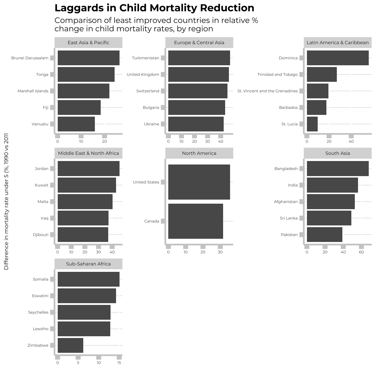
Is there a relationship between primary school enrollment and fertility rate?
Let me now inspect the relationship between education ad fertility date in particular regions. I will plot the smooth_lines for each of the regions to better undertand trends and differences in particular parts of the world.
#Create data frame with relevant variables

primenrolment_fertility_df <- data %>%
  select(region,
         country,
         year,
         SP.DYN.TFRT.IN,
         SE.PRM.NENR) %>%
  rename("births_per_woman" = "SP.DYN.TFRT.IN",
         "net_school_enrolment" = "SE.PRM.NENR") %>%
  filter(region!="Aggregates")

#primenrolment_fertility_df


ggplot(primenrolment_fertility_df,
       aes(x = net_school_enrolment,
           y = births_per_woman,
           colour=region)) +
  geom_point(alpha = 0.1) +
  geom_smooth(method = loess, se=FALSE) +
  theme_bw() +
  labs(title = "More kids, Less School",
       subtitle = "Relationship between Net School Enrolment and Births per Woman",
       x = "Net School Enrollment in %",
       y = "Births per Woman")+
  theme(panel.grid.major.y = element_line(color = "gray60", size = 0.1),
        strip.text= element_text(family="Montserrat", face = "plain"),
        panel.background = element_rect(fill = "white", colour = "white"),
        axis.line = element_line(size = 1, colour = "grey80"),
        axis.ticks = element_line(size = 3,colour = "grey80"),
        axis.ticks.length = unit(.20, "cm"),
        plot.title = element_text(color = "black",size=15,face="bold", family= "Montserrat"),
        plot.subtitle = element_text(color = "black",size=12,face="plain", family= "Montserrat"),
        axis.title.y = element_text(size = 12, angle = 90, family="Montserrat", face = "plain"),
        axis.text.y=element_text(family="Montserrat", size=7),
        axis.title.x = element_text(size = 12, family="Montserrat", face = "plain"),
        axis.text.x=element_text(family="Montserrat", size=7),
        legend.text=element_text(family="Montserrat", size=7),
        legend.title=element_text(family="Montserrat", size=8, face="bold"),
        legend.position = "bottom")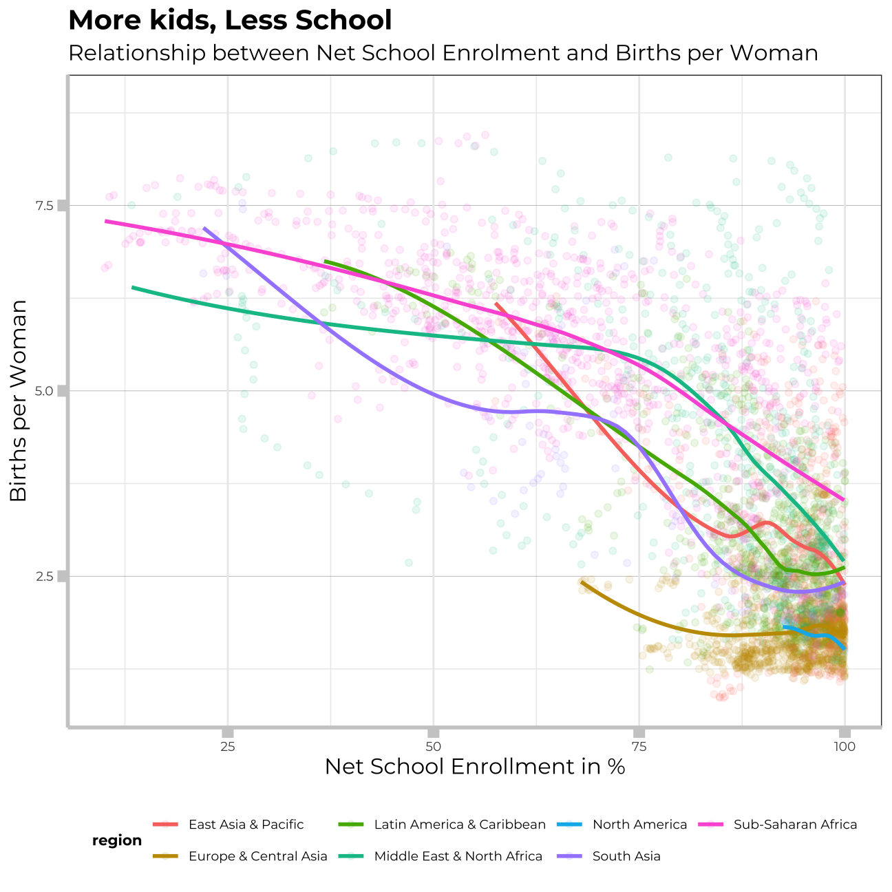
There is a significant corelation betwwen net school enrollment and fertility rates worldwide. We can deduct, that the more educated coutnries, the smaller families.
#Conclusion
The above visualisations helped us to better understand the differences in particular regions. Even though, we can observe general progress in the world, it is clear that the poorer regions still stuggle with old problems - HIV, big fertility, and low income per capita.
Thank you!
