Gender Pay Discrimination - Statistical Hypothesis Testing
Omega Group Plc- Pay Discrimination
At the last board meeting of Omega Group Plc., the headquarters of a large multinational company, the issue was raised that women were being discriminated in the company, in the sense that the salaries were not the same for male and female executives. A quick analysis of a sample of 50 employees (of which 24 men and 26 women) revealed that the average salary for men was about 8,700 higher than for women. This seemed like a considerable difference, so it was decided that a further analysis of the company salaries was warranted.
In this project I will carry out the analysis with the objective to find out whether there is indeed a significant difference between the salaries of men and women, and whether the difference is due to discrimination or whether it is based on another, possibly valid, determining factor.
omega <- omega <- read_csv("~/Documents/Applied Statistics in R/homeworks/data/omega.csv")glimpse(omega) # examine the data frame## Rows: 50
## Columns: 3
## $ salary <dbl> 81894, 69517, 68589, 74881, 65598, 76840, 78800, 70033, 63…
## $ gender <chr> "male", "male", "male", "male", "male", "male", "male", "m…
## $ experience <dbl> 16, 25, 15, 33, 16, 19, 32, 34, 1, 44, 7, 14, 33, 19, 24, …Relationship Salary - Gender ?
The data frame omega contains the salaries for the sample of 50 executives in the company.
Can we conclude that there is a significant difference between the salaries of the male and female executives?
To check it, I will perform different types of analyses, and check whether they all lead to the same conclusion
Confidence intervals
Hypothesis testing
Correlation analysis
Regression
I will calculate summary statistics on salary by gender.
Also, I will create and print a dataframe where, for each gender, I show the mean, SD, sample size, the t-critical, the SE, the margin of error, and the low/high endpoints of a 95% condifence interval.
# Summary Statistics of salary by gender
df_by_gender<-mosaic::favstats (salary ~ gender, data=omega)

# Dataframe with two rows (male-female) and having as columns gender, mean, SD, sample size,
# the t-critical value, the standard error, the margin of error,
# and the low/high endpoints of a 95% confidence interval

df_by_gender2<- df_by_gender %>%
  mutate(t_critical=qt(.975,n-1), standard_error=sd/sqrt(n), upper_95=mean+t_critical*standard_error, lower_95=mean-t_critical*standard_error) %>% select(gender,mean,sd,n,t_critical,standard_error,upper_95,lower_95)

df_by_gender2
## gender mean sd n t_critical standard_error upper_95 lower_95
## 1 female 64543 7567 26 2.06 1484 67599 61486
## 2 male 73239 7463 24 2.07 1523 76390 70088#I can see that the confidence intervals for men and women in regards to salary do not overlap. This would allow us to reject the null hypothesis, but we will carry out hypothesis testing anyway and analyse the relationships between all the remaining factors.
#I will draw a scatterplot to visually inspect relationship between salary and experienceggplot(omega,aes(x=experience,y=salary, colour= gender,fill=gender)) +
geom_point() +
geom_smooth() +
labs(title = "Experience is Valued Highly at Omega", x="Years of experience", y= "Salary") +
theme_bw()+
scale_y_continuous(labels = scales::dollar) +
theme(panel.grid.major.y = element_line(color = "gray60", size = 0.1),
panel.background = element_rect(fill = "white", colour = "white"),
axis.line = element_line(size = 1, colour = "grey80"),
axis.ticks = element_line(size = 3,colour = "grey80"),
axis.ticks.length = unit(.20, "cm"),
plot.title = element_text(color = "black",size=15,face="bold", family= "Montserrat"),
axis.title.y = element_text(size = 8, angle = 90, family="Montserrat", face = "plain"),
axis.text.y=element_text(family="Montserrat", size=7),
axis.title.x = element_text(size = 8, family="Montserrat", face = "plain"),
axis.text.x=element_text(family="Montserrat", size=7),
legend.text=element_text(family="Montserrat", size=7),
legend.title=element_text(family="Montserrat", size=8, face="bold"))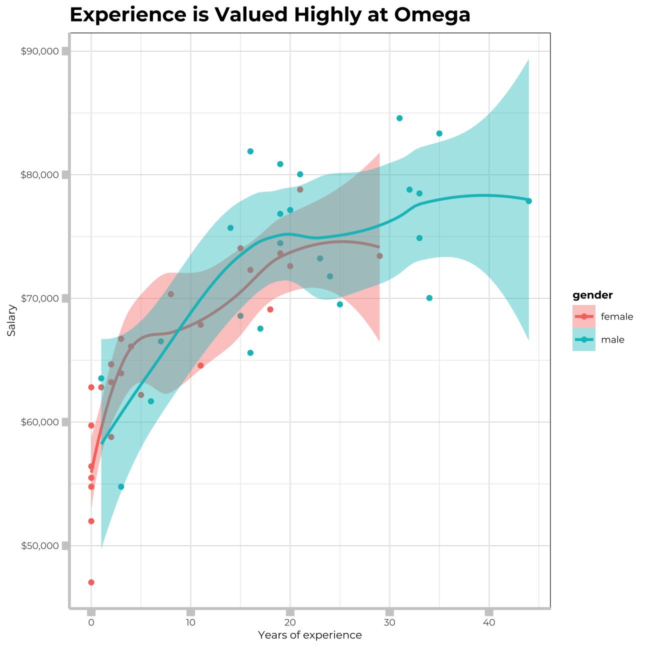
I can observe a strong relationship between salary and experience. Increase in salary comes quickly at the beginning and throughout the first ~15 years, however the gains in salary become slower later over time, displaying diminishing marginal returns.
I will further investigate the difference between salaries by gender through hypothesis testing, utilizing both t.test() and the simulation method from the infer package.
# hypothesis testing using t.test()
t.test(salary~gender, data=omega)
##
## Welch Two Sample t-test
##
## data: salary by gender
## t = -4, df = 48, p-value = 2e-04
## alternative hypothesis: true difference in means is not equal to 0
## 95 percent confidence interval:
## -12973 -4420
## sample estimates:
## mean in group female mean in group male
## 64543 73239# hypothesis testing using infer package
set.seed(12345)
salary_by_gender<- omega %>%
specify(salary~gender) %>%
hypothesize(null="independence") %>%
generate(reps=1000,type="permute") %>%
calculate(stat="diff in means",
order=c("male","female"))
salary_by_gender %>%
visualize()+
shade_p_value(obs_stat = df_by_gender2[2,2]-df_by_gender2[1,2], direction = "both")+
labs(title = "Simulation-Based Null Distribution", x="Average Salary", y= "Count")+
theme(panel.grid.major.y = element_line(color = "gray60", size = 0.1),
panel.background = element_rect(fill = "white", colour = "white"),
axis.line = element_line(size = 1, colour = "grey80"),
axis.ticks = element_line(size = 3,colour = "grey80"),
axis.ticks.length = unit(.20, "cm"),
plot.title = element_text(color = "black",size=15,face="bold", family= "Montserrat"),
axis.title.y = element_text(size = 8, angle = 90, family="Montserrat", face = "plain"),
axis.text.y=element_text(family="Montserrat", size=7),
axis.title.x = element_text(size = 8, family="Montserrat", face = "plain"),
axis.text.x=element_text(family="Montserrat", size=7),
legend.text=element_text(family="Montserrat", size=7),
legend.title=element_text(family="Montserrat", size=8, face="bold"))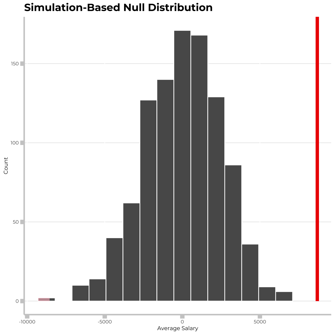
#now getting p value for conclusion

p_value_by_gender<-salary_by_gender %>%
  get_p_value(obs_stat = df_by_gender2[2,2]-df_by_gender2[1,2], direction = "both")
p_value_by_gender
## # A tibble: 1 x 1
## p_value
## <dbl>
## 1 0#p_value is tiny, so the null hypothesis can be rejectedLooking at the graph the x axis ends at 10,000 dollars. The difference in the mean values of the gender salaries is 8,696 dollars. I can see that this results in a p-value close enough to zero, so I can conclude that at a 5% significance level there is a meaningful difference between the mean salaries of men and women.
Relationship Experience - Gender?
At the board meeting, someone raised the issue that there was indeed a substantial difference between male and female salaries, but that this was attributable to other reasons such as differences in experience. A questionnaire send out to the 50 executives in the sample reveals that the average experience of the men is approximately 21 years, whereas the women only have about 7 years experience on average (see table below).
# Summary Statistics of salary by gender
stats_exp_gender <- favstats (experience ~ gender, data=omega)

# Calculate 95% confidence intervals for experience by gender
exp_gender_ci <- omega %>%
  group_by(gender) %>%
  summarise(mean_exp = mean(experience),
            sd_exp = sd(experience),
            count = n(),
            t_critical = qt(0.975, count -1),
            se_exp = sd_exp/sqrt(count),
            margin_of_error_exp = t_critical * se_exp,
            exp_low = mean_exp - margin_of_error_exp,
            exp_high = mean_exp + margin_of_error_exp)

exp_gender_ci
## # A tibble: 2 x 9
## gender mean_exp sd_exp count t_critical se_exp margin_of_error… exp_low
## <chr> <dbl> <dbl> <int> <dbl> <dbl> <dbl> <dbl>
## 1 female 7.38 8.51 26 2.06 1.67 3.44 3.95
## 2 male 21.1 10.9 24 2.07 2.23 4.61 16.5
## # … with 1 more variable: exp_high <dbl># We can see that the confidence intervals for men and women in regards to experience do not overlap. This would allow us to reject the null hypothesis, but we will carry out hypothesis testing anyway.
#t-test
t.test(experience~gender, data=omega, var.equal = FALSE)##
## Welch Two Sample t-test
##
## data: experience by gender
## t = -5, df = 43, p-value = 1e-05
## alternative hypothesis: true difference in means is not equal to 0
## 95 percent confidence interval:
## -19.35 -8.13
## sample estimates:
## mean in group female mean in group male
## 7.38 21.12#the t-test shows that we can accept the alternative hypothesis, there is a significant difference in means of experience by gender. We get a tiny p-value reported at 1e-05, so almost zero
# permutation test
set.seed(1234)
experience_in_null <- omega %>%
specify(experience ~ gender) %>%
hypothesize(null = "independence") %>%
generate(reps = 1000, type = "permute") %>%
calculate(stat = "diff in means",
order = c("female", "male"))
experience_in_null %>%
visualize() +
shade_p_value(obs_stat = exp_gender_ci[2,2]-exp_gender_ci[1,2], direction = "both")+
labs(title = "Simulation-Based Null Distribution", x="Statistics", y= "Count")+
theme(panel.grid.major.y = element_line(color = "gray60", size = 0.1),
panel.background = element_rect(fill = "white", colour = "white"),
axis.line = element_line(size = 1, colour = "grey80"),
axis.ticks = element_line(size = 3,colour = "grey80"),
axis.ticks.length = unit(.20, "cm"),
plot.title = element_text(color = "black",size=15,face="bold", family= "Montserrat"),
axis.title.y = element_text(size = 8, angle = 90, family="Montserrat", face = "plain"),
axis.text.y=element_text(family="Montserrat", size=7),
axis.title.x = element_text(size = 8, family="Montserrat", face = "plain"),
axis.text.x=element_text(family="Montserrat", size=7),
legend.text=element_text(family="Montserrat", size=7),
legend.title=element_text(family="Montserrat", size=8, face="bold"))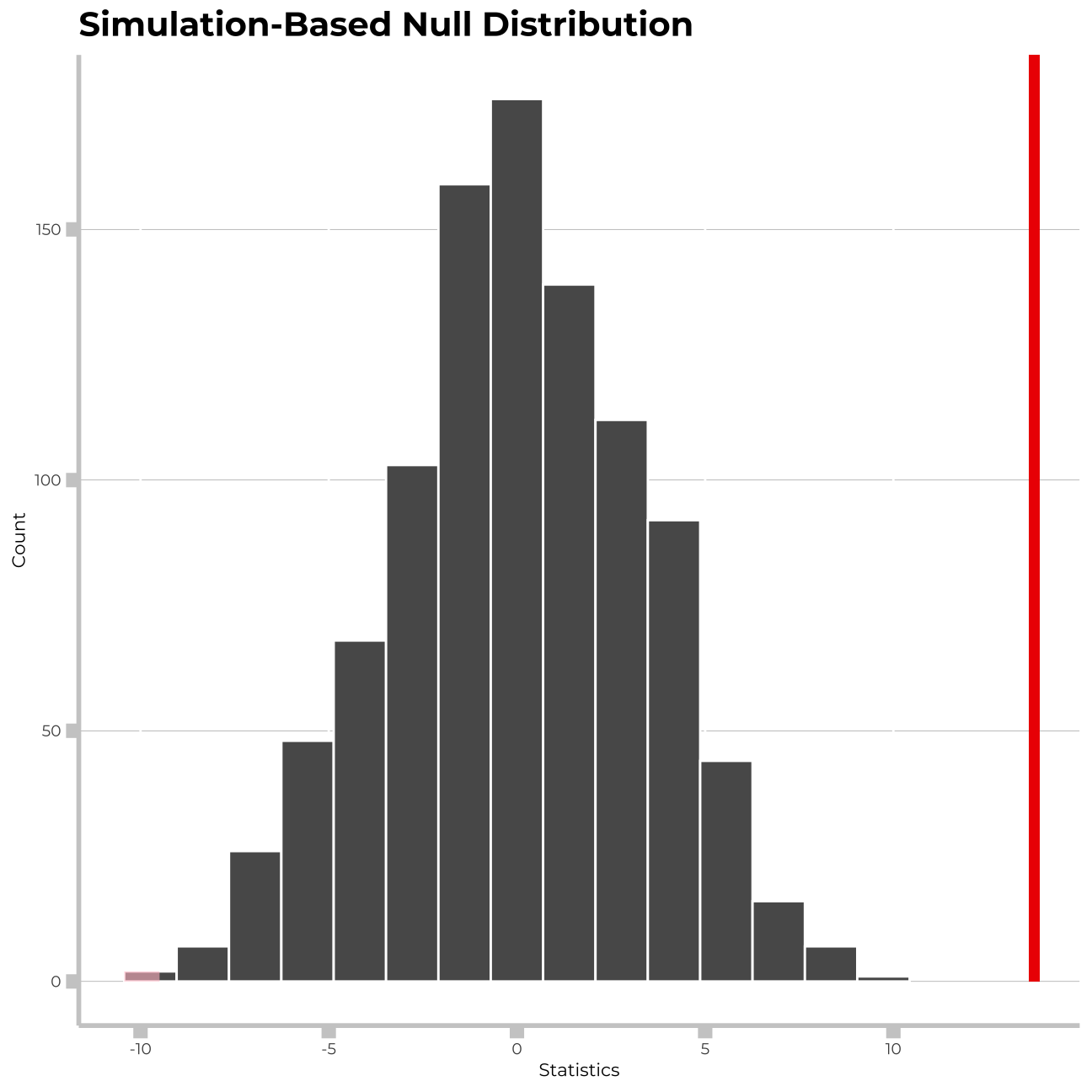
#now getting p value for conclusion

p_value_exp_gender <- experience_in_null %>%
  get_p_value(obs_stat = exp_gender_ci[2,2]-exp_gender_ci[1,2], direction = "both")

p_value_exp_gender
## # A tibble: 1 x 1
## p_value
## <dbl>
## 1 0The person who raised the issue at the board meeting was correct in assuming that there is a statistically significant difference between the mean levels of experience for males and females in the company.
Relationship Salary - Experience ?
Someone at the meeting argues that clearly, a more thorough analysis of the relationship between salary and experience is required before any conclusion can be drawn about whether there is any gender-based salary discrimination in the company.
I will now analyse the relationship between salary and experience & draw a scatterplot to visually inspect the data.
#We will draw a scatterplot to visually inspect relationship between salary and experience

  ggplot(omega,aes(x=experience,y=salary, colour= gender,fill=gender)) +
  geom_point() +
  geom_smooth(method = 'gam') +
  labs(title = "We can observe a strong relationship \nbetween salary and experience", x="Years of experience", y= "Salary") +
  theme_bw() +
  theme(panel.grid.major.y = element_line(color = "gray60", size = 0.1),
        panel.background = element_rect(fill = "white", colour = "white"),
        axis.line = element_line(size = 1, colour = "grey80"),
        axis.ticks = element_line(size = 3,colour = "grey80"),
        axis.ticks.length = unit(.20, "cm"),
        plot.title = element_text(color = "black",size=15,face="bold", family= "Montserrat"),
        axis.title.y = element_text(size = 8, angle = 90, family="Montserrat", face = "plain"),
        axis.text.y=element_text(family="Montserrat", size=7),
        axis.title.x = element_text(size = 8, family="Montserrat", face = "plain"),
        axis.text.x=element_text(family="Montserrat", size=7),
        legend.text=element_text(family="Montserrat", size=7),
        legend.title=element_text(family="Montserrat", size=8, face="bold"))+
  scale_y_continuous(labels= scales::dollar)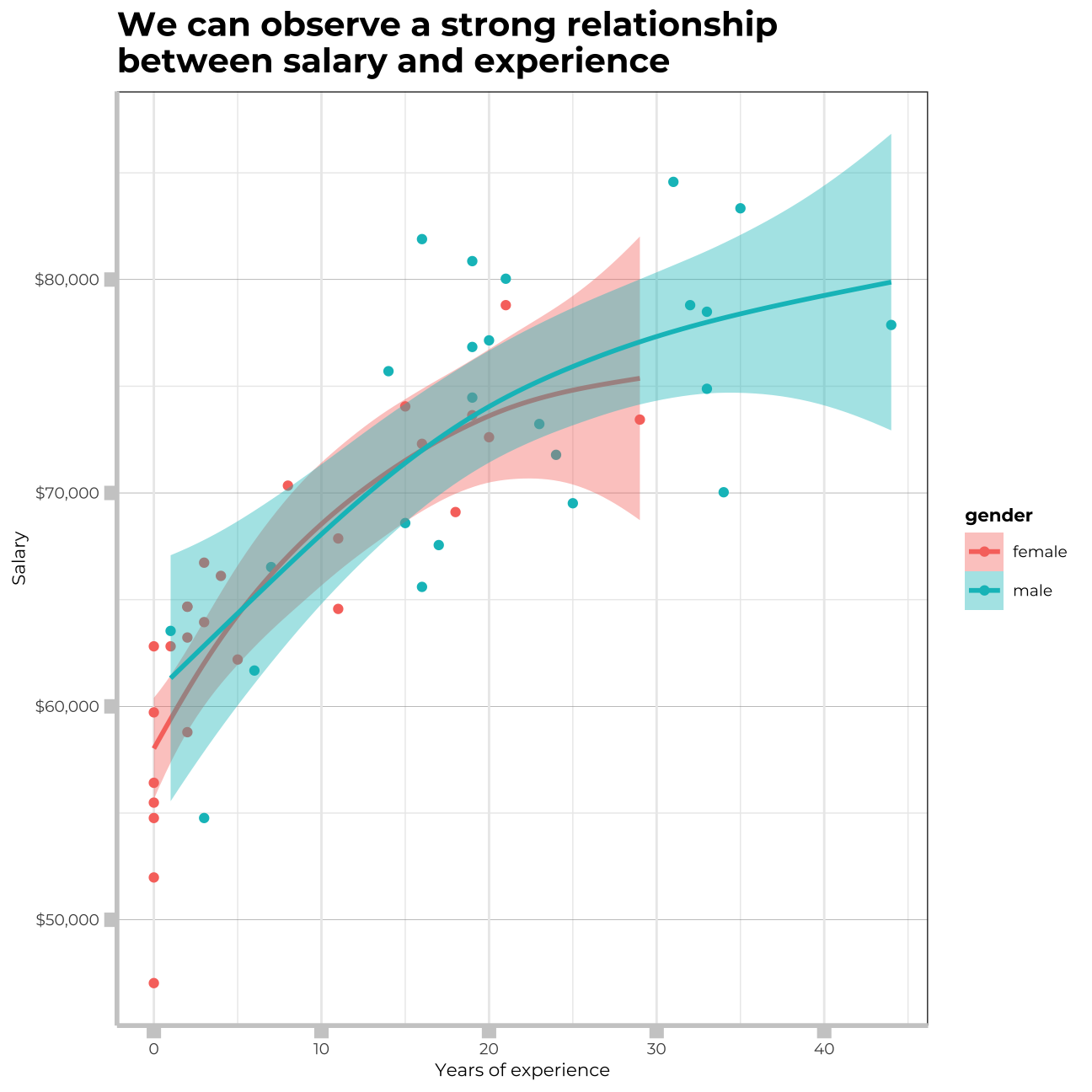
#We can observe a strong relationship between salary and experience. Increase in salary comes quickly at the beginning throughout first ~15 years, however the gains in salary become slower later over time.As my analysis above shows, there is a significant positive relationship between years of experience and salary. I can also see what was confirmed in the previous section, that women have significantly less experience than men, with a cut off point displayed above at around 30 years. This gives an alternative reasoning besides discrimination regarding the pay gap, as more years of experience are a valuable asset that is accordingly financially rewarded with a greater salary.
Check correlations between the data
I will use GGally:ggpairs() to create a scatterplot and correlation matrix. Essentially, I change the order our variables will appear in and have the dependent variable (Y), salary, as last in our list. I will then pipe the dataframe to ggpairs() with aes arguments to colour by gender and make ths plots somewhat transparent (alpha = 0.3).
omega %>%
  select(gender, experience, salary) %>% #order variables they will appear in ggpairs()
  ggpairs(aes(colour=gender, alpha = 0.3))+
  theme_bw()+
  theme(panel.grid.major.y = element_line(color = "gray60", size = 0.1),
        strip.text= element_text(family="Montserrat", face = "plain"),
        panel.background = element_rect(fill = "white", colour = "white"),
        axis.line = element_line(size = 1, colour = "grey80"),
        axis.ticks = element_line(size = 3,colour = "grey80"),
        axis.ticks.length = unit(.20, "cm"),
        plot.title = element_text(color = "black",size=15,face="bold", family= "Montserrat"),
        axis.title.y = element_text(size = 8, angle = 90, family="Montserrat", face = "plain"),
        axis.text.y=element_text(family="Montserrat", size=7),
        axis.title.x = element_text(size = 8, family="Montserrat", face = "plain"),
        axis.text.x=element_text(family="Montserrat", size=7),
        legend.text=element_text(family="Montserrat", size=7),
        legend.title=element_text(family="Montserrat", size=8, face="bold"))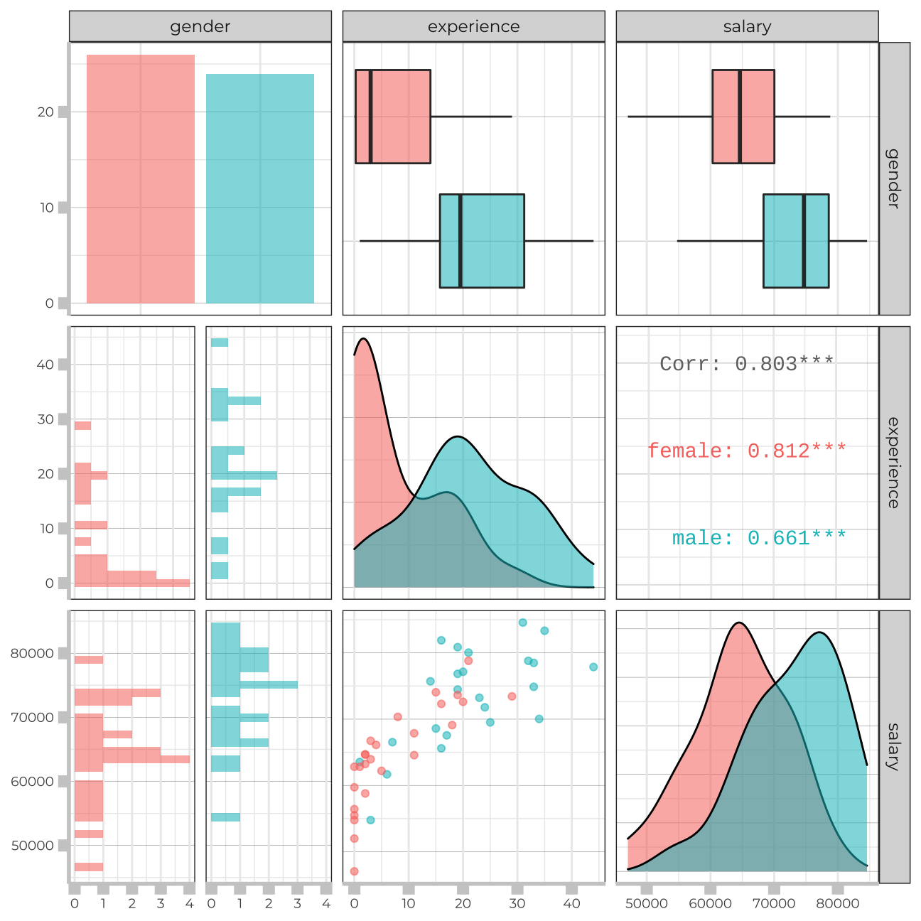
Conclusion
From the scatterplot we can see that the majority of women in the sample have a comparable salary to men with the same experience level.
The majority of women in the sample have experience between 0 and 20 years, whereas the approximate range of experience for most men is between 10 and 35 years. I also saw above that there is a statistically significant difference between the levels of experience for both genders, which confirms what we are seeing. Women seem to end their careers earlier, at least within the given sample.
Thank you!
